


We’ve made some changes over here in the living room and it’s time to talk about them – and I’m very curious what you think. If you are one of those readers who like to see how people like us (bloggers, designers, moms, crazy people) change their homes far more regularly than normal people, hopefully you’ll enjoy this post. Brady and Sara styled and shot it (I was out of town and I’m working on involving myself less :)) and I told them to style it more for everyday, not a magazine so you could see more how we live.
When we first bought this 100-year-old English Tudor I was super excited to take my style in a different direction – more old world antiques and less midcentury furniture, more neutral tones and less bright colors. And yet my living room felt just too busy and chaotic for me. I loved everything, but needed it to feel more calm.
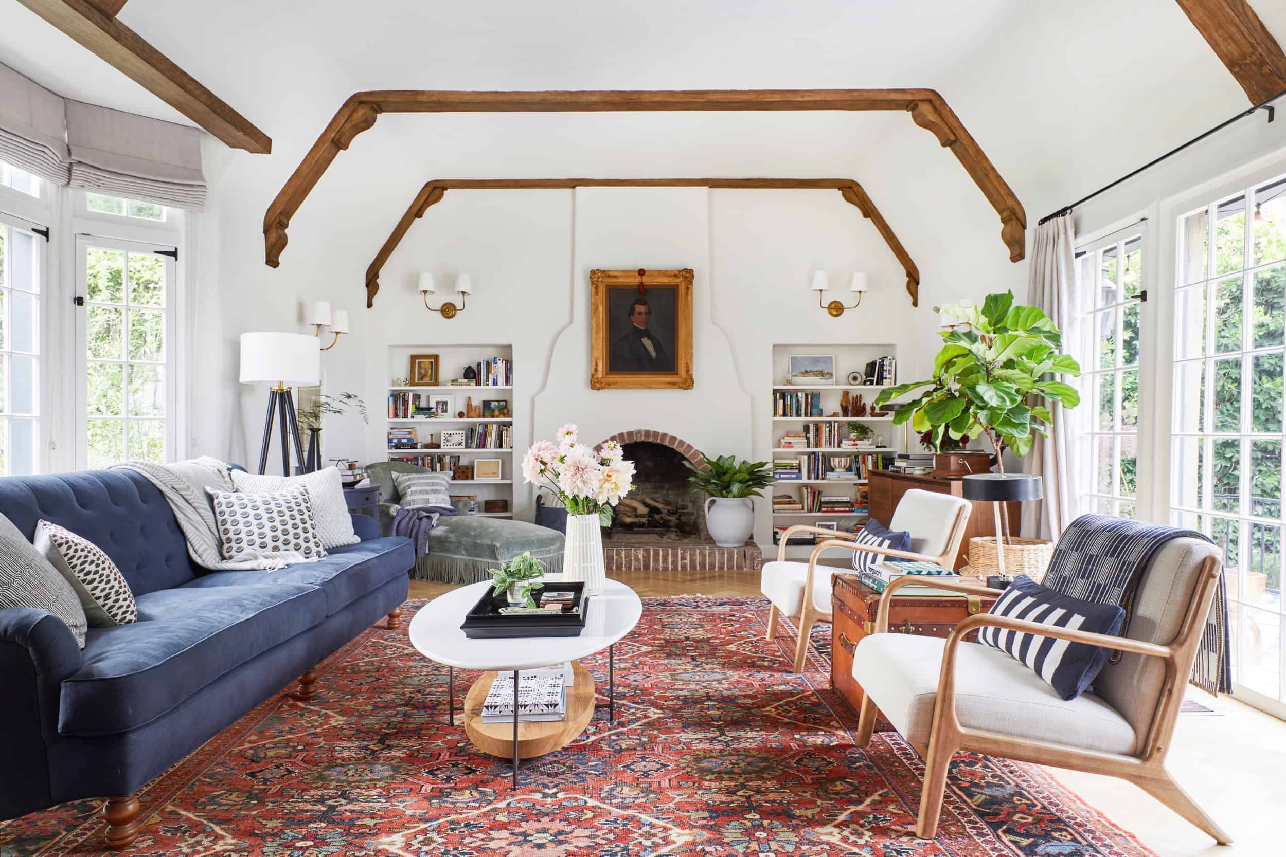
But I had to pull it together so fast for the reveal so I made it work. Since then (May of last year) I’ve made some changes and removed some ‘busy’ culprits:
1.) The Rug. I struggled HARD to find a rug that checked my boxes: beautiful, kid-friendly, would ‘pop’ off the floor and be photogenic (aka no sisal), large (at least 10×14) and not offensively expensive (under $5k). This rug was $2500 on Ebay, it is beautiful and hid ANY stain possible (the new owner might have inherited some smoothie). But I knew it wasn’t going to be our forever rug because I wanted something calmer (don’t worry, I sold it to a reader and it’s gone to a very happy, new home). So when Dash and Albert came out with a large size of the rug you are about to see, I JUMPED on it (literally and figuratively). I had used it in the boathouse makeover and LOVED how soft and beautiful it was in person (rugs are kinda hard to buy online, thus the rug-swatch industry). But I can vouch for this one.

SO much more calm, and it really simplified everything. This lady is so soft (and we have it on a 1/2″ memory foam rug pad, so it’s like a trampoline and perfect for wrestling). It’s a medium tone which I wanted – I didn’t want dark, but with two kids I can’t do anything lighter than this. And it’s a nice tone of blue – not too bright, mixing indigo and cream threads. I LOVE IT. It’s a subtle pattern that wears well and hides many stains. The cats, however, are pulling at it with their claws so if you have cats be careful because it is looped, not pulled so they can get their claws in there and they do. I end up ‘mowing’ the rug before every shoot (clipping the strings with scissors). But when it comes to the kids and dirt, it’s been GREAT so far (we’ve had it since October and it’s HIGHLY trafficked with shoed kids and our friend’s dogs).
2.) The Artwork. I liked it, but wanted it to feel more modern.

As much as I loved the creepy portrait above the fireplace, I generally wanted the room to feel more modern and young. I fell in LOVE with that piece by Colin Glasgow from the Parisian hotel makeover and bought it. It has high impact and brought an instant jolt to the room and modernized that fireplace a ton.

The art you see in this angle (above) stayed the same, but we moved the one on the piano to above the credenza to create a mini gallery wall.


I also moved some of the art around on the credenza which I’m WAY happier with (below) and I’m sad to say that I prefer the credenza without the record player, which is a massive bummer because that was EXPENSIVE. Ugh. I might end up bringing it back but it competed too much with the lamp before, and I like that it’s simpler over there now.

The two large pieces above the credenza are from Kirill Bergart and the small piece of the girls is by Lisa Golightly.
3.) The Bookshelf. Here it was before:
I’ve always struggled with those shelves, fearing that they look cluttered and bitsy and busy.

But when I turned all the books around, to show their neutral spines, for Halloween I loved it. So I styled it without the really colorful books, leaving some blue, black, and all the neutrals.

The shelves still have all of my favorite things, family photos, objects, weird wood things, but it’s WAY less busy. YAY. I think I’ll reduce it even more and maybe store some of those bright turquoise books. (P.S. as you can see, the rug we had was slightly smaller than the new one, thus our rug pad is slightly too small for this rug – creating that line you see. Now there is an easy visual fix – just shove the rug further in the room so that that line is at the back, thus less in view, but if any of you have ever moved a rug before with a rug pad with full furniture on top you’ll know that is the worst hour of your life, so I’m avoiding it at all costs. Moving rugs that are already placed is the least favorite part of my job, with hanging curtain rods coming in close at #2).

3.) The Plants. While I love plants obviously, they were annoying to care for and added too much visual weight in the room, thus adding to the chaos.
The fig tree found a new home (my styling assistant Emily) and the plant by the fireplace moved to our exterior front door.

Almost all the accessories stayed – the lighting and pillows barely changed, but I moved some trays and vessels around, as you do.

Generally, things are simplified, quieter and yes, more calm. If I were to shoot it again for a magazine we’d likely change a few things (add some more flowers, maybe some books on the credenza above) but I’m pretty happy with it for the day to day living that we do in there.
The piano area didn’t change too much. It used to look like this:

And now looks like this:

I actually like how it was styled a bit more before, but one of my schoolhouse lamps (the blue shade) shattered so It couldn’t live here anymore, plus I like that piece of art above the credenza more now. But just having some family frames, a modern lamp that contrasted the wood of the piano and some books was enough. I’m not sure if that abstract piece of art (the blue) will stay there or not, I just don’t have a place for it right now.
Below is how this sideboard was styled:

And now it’s more like this:

I traded the vintage Cherner that was in our bedroom with the 100-year-old Windsor that was here because it was FAR too fragile (although I still don’t let anyone sit on that gorgeous sculptural piece above).
Overall I’m happy with it (for now). It feels low-maintenance, kid-friendly and extremely comfortable. And now, thanks to these changes it’s WILDLY less chaotic. The kids have almost free reign (not the Cherner and they generally know that the accessories on the shelves aren’t toys).
So which do you prefer?
The old living room or the new version? Let us know below.
For more reveals from Emily’s Los Feliz Home: Powder Room | Jack and Jill Bathroom | Charlie’s Big Boy Room | Master Bedroom | Master Bathroom | Living Room | Kitchen & Dining Room | Elliot’s Nursery | Backyard | Closets | Laundry Room | Elliot’s Nursery Update | Family Room Update | Kitchen | Updated Living Room


Definitely now!! I love the lightness the rug brings in the living room. I might prefer, slightly, the old arrangement around the piano. Switching the portrait on the fireplace is such a good idea. I think having portraits like that, if they don’t represent a family member or someone you appreciate/care about, feel fake.
I admire your style and risque taking 🙂
Calmer and brighter now. Good moves!
Old version all the way! That rug was fabulous, I loved the creepy portrait, and the fig tree added a lovely pop of green. However, my style is way more traditional (I have hardly any furniture that’s not antique… Said very few 30 year olds). The before didn’t look chaotic to me. The after is lovely, too, just a bit less harmonious with the house in my opinion. I think I’d like it better with more colorful art.
Totally agree! The rug and portrait painting MADE that room! I am obsessed with antique oil portraits and have a gallery wall in my kitchen. But I live in a 108 year old house and am restoring it with timeworn and original items – so that’s more my style. I don’t buy anything that’s not antique (also only 32 years old) except for new sofas and appliances. I feel like we’d be friends 🙂
108 year old house?! Awesome! We’d definitely be friends ?
Yep! 🙂 You can check it on insta @timewornoriginal if you’re bored.
I agree, old version wins for me. Love the rug and personality of the room. I do like the styling better for the sideboard in the new version. Both lovely though, and I can appreciate that the calmness might be the overriding factor in your busy life.
Old version for me too. Mostly because that vintage rug is spectacular. Like 5 stars. But, I think the new rug suits the chairs and the coffee table better, so I do understand the change, I just mourn the loss of that beauty. I think the vintage rug just didn’t jive with the coffee table (which I think you could end up moving to the Oregon house because really — it’s striking and very modern — and it really doesn’t jive with the vibe of an English country house…)
Every piece you have is beautiful, I just personally feel the room is feeling too mid century at the expensive of its English Tudor charm.
Agree, love the red tones in the older version and the oil painting is awesome! I struggle with the same issue in my condo – I want calm, open spaces, but then my eyes and heart always go toward red and traditional lines. Thank you for sharing both version!
It looks more generic now, in my opinion it had more personality before. I do love antiques mixed with contemporary that’s my favorite style. I’m confused about your book comment, are you placing books in your own home/Living space (compared to a shoot) based on the colors not on what you are actually reading or are enjoying? That seems a bit fake to me…
Just jumping in to say that I personally own a lot of books and have three bookcases in my home in various locations. I have my blue, green and white books in my cooler colored living room, my reds browns and creams on another. All of my favorites are on a short antique bookcase in my bedroom. And anything ugly goes on the bottom shelves because they’re hidden by other furniture. My current reads are on my nightstand or floating around the house with me wherever I am when I read. All that to say — sorting books by color isn’t as far fetched as it might’ve seemed. Just throwing it out there!
Same here! I have built in book shelves in all the bedrooms and in the living room – so I have some arranged in a rainbow in a bedroom I have painted black, and all neutral in my living room – the other 2 rooms it matters a little less visually. But I tend to re-arrange a lot too. 🙂
I too have many books and always thought my living room looked busy because of the books. I’ve moved the bookcases to other spots and even to other rooms to see what would work better. I even got rid of the bookcases and put all my books in a long credenza that one sits behind my sectional that is floating in they room. Hated that because I couldn’t see what book I wanted to read or reread next. Now I’ve got etageres, not covering an entire wall, only 2. I put my favorite books and some books I haven’t read yet in the bookcases, organized by color, theme and size. The etageres are open and clean and I couldn’t be happier. After all of that, I completely understand styling for a shoot and having your space work for real life. I love how everything looks with all the changes, however the rug is the one thing I would swap out. For someone who doesn’t like swapping out rugs or moving them, the previous rug gave the room a ton of interest. Maybe a rug that has more pattern but not as colorful would work for both you and for photography.
I thought the books by color thing was insane until I realized that I’m more likely to remember the color of a book than to be completely accurate with its title, so in my experience it is actually a functional way of arranging books for a book lover.
Former librarian here. I fully ditched displaying books that didn’t fit my color palette, and either stored or recovered the few that didn’t. There’s nothing fake about it – visuals are important, some colors are jarring, and there are great books that are just plain ugly.
(I’m with you on the antiques mixed with contemporary pieces, though!)
I’m VERY interested in the details of getting books recovered. How did you do it? Is it DIY or did you send them off to someone? (please say it’s not DIY, cause I will never do it) Was it expensive? Tell me all the things, please!
My books are arranged by color/size as well and I never have trouble finding them and think it’s easier to put them away that way.
I agree that it looks kind of generic :(. I feel horrible saying that, but I don’t think the room is particularly inspiring even though it is really nice and kid friendly. I wonder if your sofa was a light gray that would have lightened up the room against your old rug. We have a Persian with a light gray couch and I’m obsessed with the look because it combines old world with a more streamlined look, and rug shopping at rug stores is so much fun (and great because they let you try rugs out at home)!
The new feels much cleaner and calming. The other felt formal and less welcoming. It was not a room that I’d want to relax. The new feels much more fun and laidback. I wouldn’t think twice about laying on the couch or letting a child play in the floor. It’s a totally different feeling where the old felt like a time for tea and retire to another room.
The piano nook is my favorite part.
I preferred the former style of this room. The colorful rug really popped, and this current one just kind of fades into the background. I get that this look is more soothing, but there’s nothing especially aspirational about it. And, you know, that might be just fine for every day real life. The previous made for a pretty cool photo.
I have always loved your penchant for weird but awesome artwork and your flare for adding color to a space, so it makes me a little sad to see you purposely moving away from that look. The old living room looked like you; this looks like it could have been styled by anyone!
What model/brand is your piano?? Need!
I love both rooms, your style is totally awesome, but would possibly consider tweaking the chairs at some point? Although I love them, they seem a bit too mid century for the room and with the sofa. What about a pair of smallish scale modern wingbacks? Maybe in a creamy Gray patina leather? Could be an elegant touch but still modern.
The previous rug was too red but the current is too neutral. I think a washed-out-from-age Persian rug in blue/gray tones would be lovely. And it would hide most everything the kids could dish out. I don’t know how you can play the piano with an armed chair. I generally like the less busy look and agree that the bookshelves are still problematic. I almost think that solid books/nothing else would make them disappear a bit more. The busy-ness/clutter of them would drive me insane. I don’t care for the modern piece you chose above the fireplace but like the modernity of it more than the portrait. I think you’ve got a nice mix of modern and vintage that bring good interest to the room and it’s nice to hear that the kids have free reign and this isn’t a Do Not Touch living room that collects dust.
Ha. A washed out blue/grey persian is exactly what I wanted and searched for but couldn’t find due to size and cost. If you can find one for under $10k I’ll take it (but then i’m like – WAIT I HAVE CHILDREN WHY WOULD I INVEST IN A REAL RUG RIGHT NOW???) I even went to the super crazy rug places in beverly hills and fell in love with one that was $140k. You read that right ONE HUNDRED AND FORTY THOUSAND DOLLARS. It was PERFECT though 🙂
Both are beautiful and livable but I prefer the old living room mostly because of the rug and the portrait painting which I could live with forever.
I absolutely love it, it is so much more you! It’s hip and fresh and gorgeous!
I love seeing how a room’s vibe can completely change by switching out a few pieces, while keeping the furniture the same! So cool.
That old rug made my heart sing, but I think the way a room FEELS is so much more important than how it photographs. I can see how the new room would feel calmer and more peaceful while you’re in it. And who doesn’t want that these days? 🙂
Yes, ITA with everything you said. I let out a sigh after seeing the “new” room. It just seems easier to breathe in. I love it. Sometimes, when you have interesting things throughout the room, a neutral rug is good not bad or bland. I think that is the case here.
I adore the before. I feel like the red rug brought the whole room together and made it layered and interesting. Now I feel like the chaise sticks out in a sea of white and blue tones.
I think as things go more minimalist (this room is not but it went more that direction) every piece in the room HAS to be in the exact right place or it looks messed up whereas with a little more going on I feel like I could actually live in it and it would look good most of the time.
I think you are right. When it’s ‘eclectic’ you can away with pieces that don’t exactly match, but when you go more minimalist everything kinda has to be perfect … Not sure if i’ve landed there yet … stay tuned …
I don’t like the new artwork above the fireplace. The black and white make that whole end of the room not really blend in, like it’s almost unfinished.
Agreed. I like the piece but not for this room. It feels jarring up there, and not in a good way. It’s so starkly modern that it doesn’t fit in with the rest of the furnishings, which got a little more modern but not enough to make that art work. Or maybe the rest of the room needs more black to make that guy make sense?
Love all the updates besides that art piece though. Serenity is important and the (beautiful) red rug was busy, for sure.
Agree. I’m okay with all other changes except the art above the fireplace. The portrait seemed more curated and much more Emily Henderson. The modern piece does not work in my opinion. If more modern is the preference then perhaps a different piece of modern art. Just not this one.
The new version brings out the architecture and really showcases the room, rather than taking it over. Absolutely love it. Also, saying goodbye to the fig tree, and indoor plants in general, is a beautiful thing. Plants/trees add so much clutter and have really had their moment. The new and rearranged art is to die for.
Plants are timeless! They are great for cleaning air, beautifying space and adding color. Sad to hear someone say they have “had their moment”. They may not be for you, but it’s not necessary to knock them in general. (Exactly why following “trends” leads to homogeny!
New version for sure! feels so tranquil….
I like the new calmer look, less magazine and definitely more like you live there and have small people too 🙂
I love both versions, but I was absolutely head-over-heals in love with your 1st version. Honestly the new picture above the fireplace makes my eyes hurt (optical illusions do that to me). But if the 2nd version works better for you and your family, that’s fabulous!
Ha. it is very STARK and i’ve used the word ‘arresting’ a few times. It may not live there forever. I bought it and I’ve hung it in a few places in the house where it’s looked amazing. I’m trying it out up there because why not?
I like both looks, but I do think the update is refreshing. I actually think removing some of the visual clutter lets those beautiful, unique pieces of furniture (like the chaise lounge) shine. The update nicely marries a more antique/collected/traditional look and modern, which I love! (Also, forever envious of your Cherner chair. I’ve wanted one since the first time I saw one in college.)
I loved the old living room, but the new living room seems more like you. It’s a bit more neutral and causal and modern but still keeping some of the older/Tudor relevant elements. It’s absolutely lovely.
thank you 🙂
I like both versions but absolutely understand why you decided to make these changes. I’ve found that the older and more vibrant my children and their personalities become, the more I’ve craved making my home a more quiet, restorative place that is a respite in moments of quiet or after they go to bed. It’s somehow a balancing thing: as the kids dominate and take up more space — mental and physical — we need to reduce the other demands on our senses.
Agree and I feel the same. Maybe the new is more generic, but if it feels more calm and that’s what the family needs, then it’s better.
Love the new room! I have something against red oriental rugs (just don’t like them) and that new rug is amazing! Also, as a mom of an 18-month-old, I loved the realness of getting rid of the plants. Oh, things I used to do…
It’s gorgeous! I can’t decide! Would you mind telling us what color your drapes and shades are? And where they are from? They’re perect!
i second that! ive been searching for that beautiful greyish blue forever
She has a post about it I think – they are from Calico Corners!
She did, but only said out was from calico not what exact color it was 🙁
I think the color is GRAY from the french general line. I think its in the first post!! Sorry …. not terribly helpful but look in the living room reveal post and see if its there …
i wish you did a close up of the shelving. hard to see.
I liked what you did before, but this feels much more like the Emily we all fell in love with!!! It has been interesting to see the evolution and I enjoy seeing the process. The thoughts behind everything is sooooo helpful. Awesome <3
Like the changes. I still love the other rug, but the new rug accomplishes the calmer vibe.
love the minimal version. calm is right. this is a great visual lesson on how to updated your home
I would say I prefer the updated version. When you came out with the original living room design, I also thought there was too much to look at it. although it was well-designed. And I also thought, this didn’t totally feel like Emily. I would say now the living room totally says ‘Emily!’ While I do like the graphic on the fireplace, I feel like it’s screaming for attention, and my eyes keep going back to it; everything else in the space is so much more calm in comparison. Perhaps it’s too bold? Or maybe that was the intent. Also, I love the rug! Works perfectly with the space
It might be too bold. I LOVE it but maybe its too jarring there ….?
No piano bench? Don’t the arms of the chair get in the way when you play the piano? I like the new artwork over the fireplace, but I liked the portrait too.
Ha. i’ve looked for a while – i should have called that out that obviously that chair is annoying at the piano. If you know of a great piano bench that works with the midcentury piano then let me know!
Overall I prefer the former look for your home though I think you could have incorporated many of your changes in the newer look without the modern look that is so pervasive in the room now. I just don’t think it fits the bones of your home. I’m thinking it needs some more tweaking and that there is a happy medium that you just haven’t landed on yet. However, after the nicky-nacky busyness of Christmas, plain, calm neutral is soothing and seems less winterish than the original with all the darker colors. Basically, I dunno. Luckily I can bet a good glass of vino that within a year you will mix it up again and maybe then you will hit the jackpot! 🙂
Ha. stay tuned. I’m still/always tweaking .. 🙂
Definitely now! So much calmer, and lighter, and still SO beautiful. Perhaps we are feeling similar in life – I too keep moving towards less and less visual clutter, and it feel so good! Thanks so much for your openness, your honesty and your writing – your voice is such a positive one in the world. Checking it with this blog is such a pleasure. You rock, Emily!
Haha!! Moving rugs IS the worst. Both versions look pretty for different reasons. The new version is very fresh, bright and relaxed.
I prefer the old room! The new room looks more plain.
love love love it now! the last photo of the sideboard is my favorite. so simple but so much impact
New!! The old rug was beautiful, but too busy with all the different furniture styles. The room looks more harmonious now. Love the Cherner’s new spot next to the sideboard!
I understand why you like the new version … I think you say you like traditional far more than you really do, Emily! 😉 But I think you could have accomplished a look that fit the house better by making all of the styling tweaks you made while still keeping the old rug, which was perfection. No disrespect to Dash and Albert, but the new rug sucks all the personality out of the room. I agree with one of the other commenters that it might come together better to fit the style of the house if you switched out the mid-mod chairs. And I don’t like the new art above the fireplace at all. It doesn’t fit the room or the house and you really need a pop of color there, even if it is calming color and not the moody portrait.
I think you are right – i LOVE the idea of traditional, and certainly windsor and primitive styles I’m always going to love, but maybe i dove too far into the trad world this first time around 🙂
I totally prefer now, both rugs are gorgeous, but this new one allowed the architecture of the room to show itself more. Same thing with the art on the fireplace, we see the sexy curves of that fireplace so much more. The sideboard vignette gives me all the feels, the sideboard in itself is perfect, but with the art, that pitcher and greenery….wow! I wonder where that gorgeous tall chrome mushroom lamp by schoolhouse is though!?
Generally like the reduction in the current living room, but miss the “soul” from the old rug. Would love to still see an antique run in there–would bring more character, though you sacrifice comfort to a degree, but more durable for the cats, and finding one that is affordable is the ever present challenge, I know! Feel like if you found one in the right size you’d be up for another future switch 😉 Love the change of the artwork over the fireplace, that alone made everything feel more modern.
WOW!!!! The new version is near perfect! Everything before that I disliked about the design is gone and the new is so much simpler and more Emily. I can see your style coming through in this room. The old lacked Emily. It was pretty, but didn’t have that fun quirky vibe. I truly love this one. Great job!
thank you!
I also fell in love with that Colin Glasgow piece from the Parisian Hotel Makeover. And I have a controversial question that I hope won’t get me thrown in jail…
I was so inspired by the piece that I did a study of it for an art class. I loved how it turned out and now have a little 8×11 version done by my framed in my office. I’m curious what the community/artists would think of this… literally just googled “what counts as an art forgery?” and am just sitting here waiting for the FBI to bust in. Hopefully it’s the White Collar Division and Matt Bomer is the arresting agent.
HA! This comment made my day. Just tell Matt Bomer that imitation is the sincerest form of flattery. 🙂
Okay, but… I really need some feedback here. Am I committing a crime??
Here’s my two-cents: Keep the framed art up and enjoy it. When you receive compliments, just say: “Thank you! It was an art study I did of a Colin Glasgow piece.” As long as you give proper credit and certainly don’t start selling them, I think that’s perfectly acceptable.
I am a lawyer and while intellectual property and copyright are not my specialty, I can advise that you have nothing to worry about. You made a copy, not a forgery, since your intent (I assume) is not to pass your piece off as an original Glasgow. Enjoy your handmade reproduction! Although now you’ll have to find another excuse to get Matt Bomer to your house…
Haha thank you Ashley and Elsie! I did get worried when a lifestyle blog wanted to snap a pic of my dining nook. I ended up swapping out the piece in my gallery wall because I couldn’t control where the picture was distributed. But I’ll rest easy knowing I’m off the hook!
Love this question / issue so much. It is very much part of standard art education to copy “master works” especially early in art education when one is learning how to handle paint, match colors, consider composition. I have a copy of an O’Keeffe, Hopper, and Kahlo that I painted in my senior year of HS and proudly displayed in my college dorm room. What my professors told me – it must be signed by you as a copy of the original and you must never pass it off as the work of another and you can never sell it.
The old one had so much more personality! The new one is beautiful but more generic.
I do love the blue rug and the lighter, airy atmosphere! There is one issue I have with your piano chair, though. No musician would ever use a chair that had arms! We actually do not use any chair with a back, either. I love that chair, but it is useless to a pianist. I just wanted you to know that small detail.
I’m not a pianist, and also love the chair, but you have not confirmed my first thought: “I wonder if a pianist would agree with this choice?”.
*now confirmed
Ha. I know. Our piano didn’t come with a bench! still looking for one if you have any ideas … 🙂
I love the now version. That rug is amazing and lightens up the whole space. Changing out the art over the fireplace was a good call too. It’s amazing how styling things a little bit differently and changing just 3 pieces can make the room look like an entirely different space. Fabulous!
Your sideboard, both the old styling & the current, are my favorite vignette ever. It is such a beautiful piece. As usual, your art choices are wonderful. They add so much life to your home : )
For me, it has become too monochrome. The old was too busy but now it’s almost too boring. Nothing really stands out, except the piece above the fireplace, which look misplaced.
The room needs life. And more colour. I had hoped for so much saturated colour in your new house and was so dissappointed with the lack thereoff, especially with the kitchen.
I love the changes you made the bookshelves–you’re right, they feel calmer now. They look great. I hate to say it–but I like the first living room better! I loved, loved, loved that rug, and I loved the windsor chair and the portrait above the fireplace. The graphic painting currently over the fireplace is not my style at all. Obviously it’s your style, which is all that matters 🙂 I’m glad you’re happy with your changes and feel calmer, as you should in your own home!
Both rooms are gorgeous. I suppose in Cali, you don’t really have a winter, but I could seè them as a winter and summer room. One’s kinda cozy, curl up by the fireplace room and the other eazy, breezy, run in and out with your barefeet kinda room!! Beautiful either way!
I wonder if you polled people based on where they live if you’d see a correlation with people in colder climates preferring the first option and warmer climates preferring the second.
I’m sitting in my freezing office in Nebraska thinking the first option looks cozy and the second looks cold.
That is a fascinating thought! I used to live in So Cal (in Northern Oregon now) and have definitely done away with more modern pieces and a very tight color palette in favor of more antiques and a slightly less-restrained palette.
I agree! In my head, I was likening these to foods (weird, but it happened). The second is a fresh crisp citrus springy summer version. And the first is a bowl warm nutty oatmeal. ?
What I like about the new version is that it is less cluttered and feels visually lighter. BUT…it looks sort of one note, or a little generic now to me. I would not look at that room and think Emily Henderson designed it. Maybe it is too neutral? Everything is blue and gray and pale wood with a little bit of black. Although I agree that the previous rug (while very beautiful), was too busy for the room, I did like that it brought in more color. I also really dislike the artwork above the fireplace–I actually like the art, but it is discordant in this living room. It’s way too modern for the rest of the room. I have every confidence that you will keep tweaking and make this the most amazing room ever, but right now I feel like it isn’t quite there yet. I hate to say anything negative! Your work is so beautiful and aspirational to me, and you rarely design things that I don’t wholeheartedly love.
I prefer the new living room but I miss the colour the old rug brought to the space. It’s a bit too monotone for my tastes. The new one is definitely more calm but it feel like it’s missing something (not necessarily that old rug, just something with a bit more pizazz colour wise). Doesn’t help blue is my least favourite colour so I’m probably a bad judge 😉
Both rooms are lovely. I think the second version reflects Socal lighting and living better than the first. As we have moved around the country, I have found that the climate has a profound impact on how we feel about certain types of furniture and colors. The original room reminds me of our traditional home in Northern New Jersey. It is beautiful and welcoming, but not the “feel” I want in SoCal. We prefer simpler lines and more neutral tones in the brighter light of Orange County.
You and your team have tremendous talent. Thank you for sharing.
Love the new! The thing that seems to clutter up the room in pictures are the shelves, but probably not in real life. It seems like if the bottom shelves had doors, and the top had fewer, chunkier shelves it would still look era appropriate but less busy.
I like the original design
Best
I feel like the ideal (IMO, of course), is somewhere between the two. I love the old version and I thought it worked with the house really well and seemed very unique, but understand the with for a little more serenity. I think someone else had the same comment that somewhere in the middle would work wonderfully.
I think this particular living room will always be a battle until the bones are fixed. The fireplace looks almost Southwestern style, is it original to the house? I think it would benefit from a more minimalist wall without the curves. I think bookshelves tend to look messy, unless they are in one of those ornate wood libraries. I love exposed beams but I feel like the ones here are a distraction vs compliment. The extra decorative pieces seem off, and the medium wood color reads casual instead of formal. I think once all the bones have a similar style this will be a piece of cake for you to work your magic.
OMG everything you just described is original to this beautiful LA Spanish style home. The “bones” are perfect and there is no need to alter them. If Emily wanted plain-ass “bones” she could have just purchased a brand new modern home, which totally would have been beautiful too but in a different wat. But to suggest altering the fireplace… (scream emoji here)! Don’t mind me just getting personally offended/FREAKED out by the suggestion to alter the beautiful original character of someone else’s home.
Kate, you just put your finger on what has always bothered me about this room. This is supposed to be an English Tudor house, right? To me, the fireplace and surround looks like it came out of a California Adobe style house. Perhaps the previous owners remodeled this to their liking?
At any rate, look at Google images or Pinterest for English Tudor fireplaces and you will see something very different. A reworking of the fireplace surroundings (including the bookcases) would really make the room come together. It wouldn’t have to emulate the 1920s dark paneling look – a modern re-interpretation would work. For example, in this room https://onekindesign.com/2017/02/08/tudor-style-dwelling-nashville/ there is a modern Tudor vibe to the fireplace and a lighter color palette than what I normally think of with English Tudor. Removing the Adobe touches would give the room more cohesion with the tufted back sofa and ball feet.
That said, I prefer the current version of the room.
100% love the NEW room!!! Both are great, it’s obviously a preference thing, but I love all things calm and your new living room is so much calmer than the old. What a difference a rug makes! (PS: I’m obsessed with the “bells” above your piano!!!! If you’re ever looking for a new home for those beauties (why would you EVER?!), I’m your gal.)
I like the current version: the lighter rug makes it look brighter and it seems a little less cluttered. Glad you are happy with all the changes!
I wish the photo you all took of antique cabinet and Cherner chair was a book cover, because I’d buy it in a heartbeat. Literally perfect. Perfect!
I think most people will say they prefer the old one because of the “wow factor” of that red rug, but when they look at the actual details/styling, they’d see that the new version is super clean and well put together. Your red rug is super “in” right now (according to instagram in general), but it doesn’t mean that it was the best rug for your family or for the style of the space. I really like the look of the room overall with second rug (says the girl who just ordered a runner similar to your red rug on eBay YESTERDAY). The only constructive thing I will say and I’ve thought it for a while… it really has stood out to me when you write about buying pieces that are special. I feel like so many elements of the room are SO special and make my heart flutter when I see the pics, but it seems that the pair of mid century chairs are lacking that quality. If I saw a post from you titled “deciding on new living room chairs”, I’d be clicking on that sucker so fast. xoxo
Love the changes!!!!!
I’m wondering: I feel like I keep reading about “color!!” In home decor and Jewel tones and even purple, yet… All I want is calm simplicity. (Living for Corbett’s house decor for example)
Is the wild decor coming back? Will we all change or minds collectively?
The old wasn’t quite there but the rug gave it some personality. The new feels calm but bland. I long for color other than neutral blue. I do think the piano area is lovely.
I really dislike the new art piece in this room. Artwork is so subjective but for me it’s fighting for attention with the rest of the room and distracts from the beautiful curves and brick of the fireplace. Your room has amazing architecture, let that be the star. I even imagine painting a subtle color on the wall surrounding the fireplace would really help it to stand out and no art would be needed.
Is it possible to take out a few of the shelves so you can style some of it with larger, simpler items? (Even if it requires cutting them out.) I do think they look nice as is though and would never rid of them completely.
I like both. The original is warm and cozy and interesting. The update is cool and refined and calming. Its fun that you were able to achieve both looks with relatively minor changes.
I will say the shelves are still bugging me and its not really the stuff on them which looks amazing in both pictures (you all can style shelves like a boss). I wish the actual shelves were a wood tone that matched the beams. That side of the room needs something dark and organic to complement the brick fireplace surround. Or, maybe paint the fireplace a slightly darker tone so it pops out more. I don’t know. I like contrast though so take it with a grain of salt.
Also – I love the new modern art, but man it looks photo-shopped on my screen. It keeps making me squint.
I’m definitely team REFRESH. Actually I would probably have taken it a step further and even ditched the fringed chaise as well. It just kind of seems like a sad caterpillar to me. The new piece over the fireplace does most of the heavy lifting of updating/modernizing the room and I love it, but I think a more comfortable and inviting chaise would also help. I’m also a bit confused by the wheeled end table by the sofa. Does this table really get moved around the room?
I’ve always thought of designing a space as a process rather than an event. Anytime I rush and make it an event, I regret some of the decisions/purchases and wish I’d been more patient and waited for the ‘right’ pieces instead of the ‘right now’ pieces.
I seriously almost spit my coffee out at “sad caterpillar!” Thanks for the laugh!
Man this was tough! I thought for sure I loved the new rug until I saw the before and after together… But really I think it’s the artwork over the fireplace that is throwing me off. I just don’t care for the ultra-modern print, but I didn’t love the overly-antique piece either. I think an in-between would tie everything together and I can go back to loving that amazing new rug. And the old one…okay I’m still conflicted
Hmmm…I like a combo of some of the old, and some of the new. But you are the only person, besides your husband, that really matters in this equation. What I love the most about the new version is the less is more theory. You have less busyness, which I love. Bookshelves are the bane of my existence as well. They always look so cluttered. Mine are currently empty. I couldn’t take all the stuff, and just cleared them off over 2 months ago. They are still empty, and I am much happier. But my closet is a little messy, with all the shelf accoutrements. Someday I will get sick of empty shelves, and find my bookshelf happiness!
I liked the before AND the after. However, I would have switched out the blue sofa for a neutral colored sofa, but kept the before rug, which I feel is more special. Also, I believe a mirror should live above the fireplace rather than either of the pieces of art. That said, everything you and your team does is magic and Pinterest worthy. 🙂
I definitely like the previous version better. More gathered and homey feeling. This one seems a lot more generic and less warm.
Definitely new, feels more eclectic and less ‘old, traditional’ house
Team New all the way!
I prefer the new version because it is so much calmer, lighter, and brighter.
I understand why you would want to make some changes to cool it down a bit but I feel like its too cold now. The modern painting is too much for this room/house. It just doesnt belong. Overall, something is missing in the new version that the old version had. Character perhaps? I dont know. I just know that in the new version it looks generic and plain.
I love the new room. It’s genius. Balanced and fun and creative and really, really, really, ridiculously good looking. ?
You did accomplish a fresher look but I really loved the first rug and the energy it gave the room. Loved the art updates and new lamp on piano. Oh and the (Cherner) chair. That chair …
Both versions are lovely, but I’m drawn way more to the former. That red rug was something I dream of one day owning and went so well with the style of your home. I think the new version makes perfect sense though for your current phase of life and living in SoCal. I hate to be critical but the only thing I just can’t get on board with in the updated version is the painting about the fireplace. It just doesn’t seem to go with anything else in there. Overall, both are wonderful, cozy spaces though!
I commented harshly against the before, so I feel I need to comment on the after. I like the after better, and the main culprits are fixed, as you said. But I still think it needs more work. The new rug is in the right direction in terms of color, but doesn’t really work. It is too casual for a space that, like it or not, is quite grand. I think you need a richer rug, still monochrome but perhaps with some bolder texture. The bookcases need to go. If you really want bookcases, I would do them deeper and taller, with raw wood shelves. I think the fireplace/bookcase wall is screaming for some treatment, may be some stone on either side, or painted wood on the fireplace, or something. It is too plain, the fireplace opening is weird, and the bookshelves end up emphasizing its plainness. I loved the parisian hotel room, it’s my favorite post of yours since SFAS, but I agree that the artwork feels disconnected here. Have you tried switching the chairs with the sofa? It feels strange to have all the granny-chic upholstered pieces on one side and all the midcentury modern ones on the other. I also think the coffee table is too narrow for the space, I would do multiple ones to capture the flow better. I’m an amateur, just an opinionated one:) Come on Emily, you need to make bigger changes here. I know you worked a lot and spent a lot of money, but I would go back to the design board.
You weren’t joking when you said you were harsh! You are talking about a major redo not a re-fresh…. You must be a real blast at parties! 😉
Don’t I know it… I have to live with myself all the time!
Haha… you guys are cute.
The new update, for sure. Like you said, it’s lighter and less chaotic and looks like I imagine what California feels like. And as someone who has followed you from HGTV, in my opinion, it just looks like you. I love it. ?
Not an either or for me. Both look great. If this were my space?I would use the original rug and styled everything like it currently is giving it a more stream line look. The original bookcase appeared busy.
In the past, before you blocked the negative comment trolls, you asking us to share our opinions would have triggered a mini-panic attack! Thank you sooo much for making that change as I enjoy the peek into your design process as well as those of other followers/readers (?). My first thought is that I appreciate both style directions but for different reasons (since you asked!!! my brain is shouting at me “whyyyyy would Emily Henderson care what you think.!?” ; ). I also loved the old rug but understand the desire for calm and the new rug provides a moment to take a breath for sure. I haven’t figured it out yet but something still isn’t quite right to my eye..? I think it might be that regardless of the style nirvana you and your staff achieve, I am always wondering what the room would look like without the bookcases (and if they were gone, could the sconces on that wall be lowered.!?)? Regardless, I have learned SO much from you/the blog/your staff over the years and these kinds of posts remain a wonderful opportunity to delve deeper into understanding some of the nuances of interior design. (Case in point -all morning I have been contemplating how our design aesthetic evolves as our needs change. When my child was young, we played an indoor game with a soft bouncy ball so plants were not welcome but now that he is grown, my indoor plants are as much necessities as my sofa and side tables.) Anywaaaay, thanks for asking!
Again, since you asked, I find the scones kind of jarring. FWIW:)
I love that you appear to have returned to the style we originally loved about the Emily Henderson, Secrets of a Stylist lady.
It seems to me to be much more creative and exciting to design interiors counter to the esthetic bones and provenance of the house.
(ie: modern mid century esthetic living beautifully in a century old building)
I’m happy to see you apparently inately felt this as well.
I like the colors better now, but I would like to see you play around with the layout. I know you struggled with that, but I don’t like the chairs in front of the patio doors. Also, I think you are missing the opportunity to put your chaise in front of the beautiful bay window. I would personally love to sit there and read my book, or read aloud to a child. What if you faced the sofa to the fireplace, and put your chairs in the corners by the fireplace? Would that not be photogenic?
I’ve always loved this room since the very first photo you posted. That fireplace wall is such a gorgeous focal point.
Didn’t you at one time consider eliminating the bookshelves? I think that was a good instinct…if you added doors, or plastered them over, it could be a huge improvement. They are what makes the room appear busy/bitsy to me.
I would also move out the chaise, maybe to the family room, and put a nice tree in its place.
Finally, I LOVED the ornately framed portrait over the fireplace. An inspired contrast! Bring creepy old guy back!
Old style is way homier and comfy looking, but you do you!
LOVE the new look…not like the old book was bad at all. The new look just feels so fresh and more modern. It’s stunning
New! I love how much more calm it feels. I switched out my old IKEA staggered striped rug with something with quieter and I love it so much more now. I had no idea how much energy the room had before and def prefer the quieter feel, and like you, want to make it even more calm. Great job, team EHD!
I like that the new room feels less cluttered, but I think that is more because it was styled for everyday living vs. an unrealistic magazine shoot. I think the old rug was beautiful and brought so much soul to the room. This just feels kind of generic and flat to me now. I don’t think the problem was the rug before; it was the amount of unneeded stuff in the room. I think the perfect balance is something in between the two. But what really matters is that you guys love it.
The new version is fresh and simplified, I really like the new rug. Thank you for sharing your home with us Emily, I love your style and have followed you for a long time. In a world where this was my house and I had an unlimited budget (haha) I would buy another sofa to match and have them facing each other for balance. I’d move the chairs on each side of the fireplace (sorry chaise). Ahhhh, always fun to dream!!!
Both are beautiful, but I do prefer the calmer vibe of the new version. BUT! I would bring back the portrait over the fireplace and a back in a few of the plants (my favorite accessory!)
I so wish the new rug weren’t so expensive b/c I’ve been looking for something neutral like that for ages.
I just loved your previous rug with the color and history it brought to the room. I like this one a bit less. BUT…the art change above the fireplace is sooo good! It ties together the hits of black around the room as well as the pillows and throws on the chairs. I just love that Mr. Chernier is in a more prominent place as well!
When I look at the two photos I liked the original design better. The pattern of the red rug is more visually interesting. But I TOTALLY get wanting to live in a space that feels calm and airy. Sometimes I walk into homes/rooms that have this wonderful English cottage type feel with collected furniture and interesting art and knickknacks and I think, how adorable and cozy, maybe I should add more art or furniture to my living room. And then I get home and think, no, I like it exactly as it is.
I loved the room before. It felt so cozy and like it had a story to tell. The new room, while more neutral, does not feel more calm to me. It feels sterile with no sense of personality. That would be good if you were staging the house to sell…
I love the gif that is at the beginning. It is so fun to see the different styles switch back and forth.
As a nanny, I know that kids play a big role in how a house feels, and I agree that the second style is more calm and kid-friendly. It looks relaxed and put together. Sure, I loved the red rug, but I also loved how you described this rug and how it feels and what it’s like to play with your kids on it. I like how you were willing to try something that worked better for your family and made you feel more at peace.
I love it all. Plus we know it’ll change again next week because you’re a creative genius who is never going to stop. My living spaces are always in flux, too. Life is fun!
I love the fireplace wall so much more now, lighter and brighter. It felt heavy and dark before. However I would personally put the old rug back in and see how that looks. The blue one makes the whole room too neutral and rather boring. Feels like the rug would pull in color from around the room in all the right ways!
Hello! Have you ever used the Dash & Albert indoor/outdoor rugs for a living room? I live with a huge dog who is prone to having accidents, so we need something that is easily washed, but I dont want it to feel like plastic and not look nice in our living room. Thanks for the help!
Jessie, I have several Dash & Albert indoor/outdoor rugs. They aren’t plastic looking, but they aren’t living room material either, I would have to say. I have one in my kitchen, and one in my bathroom, and 2 on my deck. They do wash up amazingly well. I bet you can find many stores in your area to check them out. I have the diamond patterned rugs outside in black. The green diamond pattern in my kitchen. Bathroom has the rope pattern. I believe they actually have rugs for pets?
I’d very happily drink a lot of wine in the new version. 🙂
Is the sofa seat foam or a down/down alternative filling?
I absolutely prefer the new version! I see the Emily I fell in love with <3 The before was never ugly (I don't think you can do ugly) but the after looks younger and more hip. The only thing that makes me a bit unsure is the piece of art above the fireplace. It's pretty but I don't think it's powerful enough for that space. Jut my opinion. Lots of love
LOVE the newly styled room. More of a mix. The modern quirky touches (including that amazing art above the fireplace!!) feels warm & personal. I like all your changes & most importantly, as one of your followers, I love to see identical rooms change personality…. Bravo!
SO much better! It feels warm and inviting and yet more serene. Now just chuck that chaise, ugh, I’m sorry but I just can’t get past it. It feels out of place in this otherwise gorgeous room.
The old version. To me, this is drab or bland. I guess I like the coziness of the first, and it fit in with the period of the house. But those beams are kick-ass and make a statement of their own!
Definitely the new version! So much brighter and I love the art!
I really like both but do feel that the 1st version had the edge for me. The 2nd version looks calm but also a bit cold. I feel it needs more pink or another warm colour to counter balance all the blue tones.
I love this room sooooooo much more than I did before! You have such a nice open space, and the toned down version suits it. I think a typical english home would probably fit inside that room (at least my house would!), and the first look would make more sense in a smaller ‘cosier’ living room.
I want to move the sofa so it faces the fireplace and is flanked by lamps. And i want to place the chairs on either side of the fireplace in front of bookcases with lamps and a place for a glass next to each. A smaller rug to host that grouping – and enough room to access the glass doors. Can the piano be moved forward to become its own destination in the middle of the room – so you can look outside whem playing ? Then put the plants by the doors – and remove the credenzas… The kids would have lots of room!
Light and lovely!!
The room feels more open now…..love that rug?
Definitely liked it before so much better! The new style doesn’t seem cohesive with the style of the house and feels cold. The rug, art, and fiddle leaf fig made the room. Ah well, not my house! At least you love it.
I like it better now, I just don’t think the picture above the fireplace really fits. Could you take the lamp off the credenza and put the record player back?
Love the current version so much!
I get why you would love the change. But I wonder if you would also love it as much if the styling was reversed? In other words, if you had done the new design first (with the blue rug) and just now done the red rug and creepy portrait? Sometimes change feels fresh and great just because it’s change. The first feels like a cozy “winter” look, and the second, more like a breezy “summer” look. I’m totally with you on the fig tree. I would enjoy cocktails with you in either room, however!
Oh Emily….I hate the change…it’s missing the warmth and richness………that carpet made the room……..so sad.
Sorry Emily. Absolutely loved the warmth and comfort of the original room. It looked like a room that people actually lived in. Whilst the new version is pretty, it looks like a room that has been styled for a magazine.
First one!!!!! I don’t dislike the new version but it doesn’t feel quite pulled together….maybe too much blue! And the new one feels cooler (in terms of warmth) which doesn’t do much for me right now……
I liked it better before. The prior rug was dynamite, the new one? Blah. Of course everything you do is amazing, just a little less amazing now.
I’m fascinated by how changing the art above the fireplace shifts the mood of this room. It’s one little piece but, I think that change struck me most.
The original version seemed a little busy but in small ways. I would have done a more muted rug but in the same style, the current version of the bookcases and since I love plants maybe some different varieties.
The new simpler one Love this post thanks!
I would also paint the insides and shelves of the bookcases black, hang the new art work horizontally, switch out the sconces above the bookcases for black ones that focus down – maybe 3 picture lights – including one above the art. Move a credenza – or the piano agst the back of the sofa. Hoping there is a way to plug in lamps. Can’t imagine how you read or see in this room at night… Love all the elements!
This was very interesting. I like hearing about the thought processes behind your styling decisions.
I love the updated room!!!
While the old room looked very “designed” and collected, I can definitly see how it would feel chaotic to look at/be in every.single.day. Readers only see it when you choose to share….we aren’t living in it! The only thing I’d change is maybe a more interesting rug. I love this one and totally get the utilitarian upside- but I think there is something just a little more special out there that is perfect for this room. You just haven’t found it yet!
If it was my house? I liked the old living room! I felt like the previous rug seemed more “special” and more consistent with the English vibe, but then I’d probably be happy living on a movie set for some old-lady British murder mystery show. It’s funny because I’m obsessed with your blog even though I probably have a much different style than you.
BUT…The new version seems much more “you” and I’ve followed your blog for years. I admit I was excited to see you embrace the whole Tudor thing because I thought “yay! stuff I’d buy myself!” but this version of the room seems like a much better mix of your previous house and this new house. And from an educational design-blog perspective, it’s fun to watch how this house has evolved.
Random thought: did you ever consider looking for a patterned rug (Indian, Aghan, etc) that uses more tonal colors? I ask because we purchased a more traditional rug for our home that’s busy in terms of the pattern, but with only shades of blue, cream, and some (minimal) gold. It’s somehow both quiet and busy, and I’m obsessed with it.
Anne: I totally agree. Emily’s first version was more like a client wanting an Englishey living space by EHD. Whereas the second version is EHD style all the way.
Emily: They are both great. Just change the artwork over the fireplace.
The modern painting makes me think Enron logo. Or maybe I’ve just been in advertising too long. I think either one or two are a personal preference but the fireplace is crying out for art with more soul or whimsy to it. The blimp art has whimsy to it. The old guy had soul. Something kind of art with a wood frame and soul or whimsy would make the space.
I’m nordic, so I love a neutral palette and minimalist vibe, plus I’ve been searching for the perfect blue gray for most of my adult life; when others see bland, I tend to see serene and calming.
So what I’m about to say goes against everything I stand for: I like the older version. Gah! I said it. The blue in that rug brilliantly brought out the blue in the sofa, made it a star; now both rug and sofa seem a little blah, which is a shame because separately I think they’re beautiful; previous rug also looked better with the green chair.
Before, the art over the fireplace (the dark color, the frame) really gave the room depth and seemed to pull it together, giving a shout out to the beams; current art seems so bland. Previous look just fit this room better. Current look is nice, but lacking that something special, that Emily spark. Before it was exuberant Emily, excited in an instagram video about an upcoming reveal; now it’s slightly sick and pale Emily telling us she’s not feeling her absolute best and will be up and at ’em tomorrow. Does that make sense? Sorry, this seems terribly harsh, just trying be specific. Usually I’m all over an Emily room.
That being said, love all the individual vignettes, esp. that gray cupboard, and the mid-century with the blue-shaded lamp.
Generally, like it now much better! The new rug is better, though I wish it had a larger-scale pattern. Still subtle, though—I love the that this one doesn’t compete for attention. I loved the Colin Glasgow piece in the Parisian-style room, but am not feeling it for this placement. The frame feels like it’s competing with the artwork’s lines, and it feels abrupt over the fireplace. The portrait wasn’t right, either, but something like a vintage landscape or newer abstract or landscape that would bring in a little more softness, movement, and color without taking over. like the Cherner/sideboard combination a lot.
The new is great, and I’m all for modern, but I adored the “before” eclectic mix. The oriental looked like it had always anchored the floor with the furniture evolving. I miss it. And the missing portrait feels like an old friend is gone. The new look is calmer, but the “before” seemed happier.
New version! It’s like my eyes breathed a sigh of relief to see it less cluttered and more calm 🙂 Very cohesive, and definitely a place I’d want to live in! It makes my heart hurt to see other commenters call it “generic” – How could a place with beautiful architecture and special/vintage pieces mixed throughout ever feel generic? – But I suppose it’s just personal preference.
The one piece I miss from the old version is that wonderful portrait above the fireplace (although I love the new modern piece too, but for different reasons). Maybe he’ll sneak his way back in one of these days 😉
I love to see style’s evolve and change – even if it’s simply to lighten up for spring/summer and cozy down for autumn/winter. The old rug had such personality but I am a huge D&A fan and l do love the new rug.
Question though: I’ve always been wary of specifying a rug with viscose content to a young family and/or one with pets. Other than cat’s claws, have you had any issue cleaning/caring for the rug? I know you said it’s hiding dirt really well. Have you had to clean up any spills yet?
Thanks in advance!
Looks 100% lighter, brighter, and calmer now.
There are features/ vignettes that I like better in the old and new. I like the piano in the old, the painted cabinet top in the before, but the sculptural chair in the new, and the rug in the new is better. The bookcase and fireplace are a miss for me in both.
I’d love to see some additional warm colors scattered in the room to liven things up.
Surprisingly, I like the new one better. I love color, and I really love red, but the blue rug and decluttering make me want to come and sit on your couch and read a book with a nice glass of wine. It’s a lovely room in a lovely house. I’m a big fan and always look forward to your posts.
First version is my preference, just my two cents. I do like the proportions of the new artwork over the fireplace, although the image feels too tightly cropped. I also am in love with that square Target landscape abstract “painting,” I bought one shortly after your post about it, which is totally not my normal schema, but hey if it’s beautiful it’s beautiful.
It’s funny, before I read your post I was 100% in the “before” camp. It felt cozy, homey, airy, modern and traditional all at the same time. And. That. Rug…
But now that I’ve read this, I totally see what you mean about the cleaner, less cluttered “after”. It really does make everything feel so much more calm and peaceful (you’ve convinced me, haha).
The two things that I don’t love though are that the beautiful traditional sage-ish green chaise kind of feels out of place in this white and indigo room of more modern furniture, and the painting over the fire place (too stark and modern). But really, I’m nit-picking. Both spaces are absolutely gorgeous.
It is interesting to compare each wall/furniture grouping, as well as the room as a whole. Overall, I definitely prefer the current version. Each grouping has improved too. It’s more modern and calm yes, but the details make it absolutely original and personal. The color palette is softer but not nearly monochromatic. Although I think the old rug is gorgeous, I agree that the pattern was too busy, and it threw off the overall palette, which was more cool to begin with. Maybe if the wall color had been warmer along with some of the other furnishings, it could have worked. But now I don’t miss it at all. I am in love with new artwork over the fireplace as well. It definitely gives the room that design edge now that the palette is less varied. The room doesn’t need more black, which would kill that calm and cozy factor; It’s just right.
My preference is the modern update. My eye wanders around and cannot find a place to rest and settle in the original, primarily due to the bright color and pattern of the rug. The update just feels so calm and intentional that I want to hang out in that room all day. Very nice!
The artwork over the fireplace is an important piece for you. It has influenced the new direction of the room, and how you are looking at objects and space. I’m not sure it’s the right place for it though. The shape in the artwork does echo the beams, however, they are dissimilar enough that they fight with each other rather than compliment each other. And the brick below distracts as well. I feel like all of the architectural features (fireplace, brick hearth, chimney, bookcases and beams) around the artwork compete with it visually and close it in, rather than let it rule the space. Maybe this piece doesn’t like sharing lol! I actually wonder if in this new design there should be nothing at all above the fireplace?
Modern!! Much calmer!
I like the new living room. It looks very modern, open and simple. Is there reason why you still hold on to the side board which looks rusted.
I love the new rug! And all the changes you’ve made make it feel so much calmer (which is necessary with kid chaos ;)). The only thing I would change if it were my house is the size of that credenza by the fireplace. It would drive me crazy blocking the bookcase haha. Beautiful as always though, love everything you do!
I *thought* I preferred the old version–was so sad when you got rid of the rug–but MAN do I love the new version. The new version wins 1000%! I think you went old-world wild when you first got the house, but now the balance with modern is perfect.
Overall I like the new changes, as the room feels calmer. I think, however, I would like the changes with the old rug. I personally loved it, and while I like the new one, it’s a little flat to me. I do really like the new modern art over the fireplace.
One thing I’ve always wondered about this room – how did you decide on the size of your coffee table? I am wildly less qualified and talented to make this statement :), but I’ve always wondered if it’s a bit too small visually? Just wondering what you thought about that. I love this room, though. So gorgeous!! I have six of the Cherner chairs (from my grandfather – no one else wanted them?!?!) and they are gorgeous but fragile! They creak whenever anyone sits on them and people are always terrified they’re about to collapse! But they are my favorite dining chair in the world. So so beautiful.
Love that new print. It’s a breath of fresh air! And the switch to a lumbar pillow on the chaise makes a big impact. The room was great before, but this is too. That portrait was awesome until I got depressed about patriarchy and race privilege and class privilege and men in general. It’s just a good time to have a different piece there if you’ve been feeling the same. I’d kinda like to see the bookshelves back as they were with colorful regular books, now that the art and chaise look different and the plant is gone. That could be a nice combo. <3
Well, as they are both beautiful, I hate to criticize anything! But I do think that while I love the calmer, cleaner feel of the new room, I also think that it still lacks something. It did always seem to me that the gorgeous rug didn’t quite work with everything else in the room, but this new rug is TOO calm and bland. Maybe try a more subtle, tonal pattern than the old rug but with some movement to it? I do love how much more visible the lovely old chaise is in the new room. And I agree with some others that the new artwork just doesn’t work well with that fireplace, although I think moving away from the old-guy oil painting may be good. Something modern but less stark and angular would please ME. And I agree that drastic as it seems, getting rid of those bookshelves seems like a good idea. They fight with the unusual fireplace, in my eyes.
It is almost like you had a fall winter look with the oriental rug and now you have a spring summer look. I personally liked the cozy feel of the fall winter look.
I like both rooms. I think my preference is the new room. Although there are some things from the old room I prefer. I think the bookshelves look much better in the new room. They look less cluttered. I don’t care for either of the paintings that you chose for over the fireplace. There are so many beautiful paintings available and I don’t think either of them are appealing for different reasons. I liked the styling of the piano better in the old version. I much preferred the lamp in that version especially the blue shade. I think the new rug is very beautiful and I prefer it to the old rug.
Love the current set up! It feels more ‘EH’ to me – a mix of some traditional pieces as a nod to the house, but the modern pieces reflect the fact that a young family lives here. It feels very welcoming!
Love love love the new version! That’s exactly what I’m trying to accomplish in my own living room right now. We have crisp white walls, a neutral couch, sleek leather arm chair, minimal, modern-ish decor, but with a rug like your old one. It’s a struggle because like you, I feel like no amount of paring down on things in the room will make it feeler calmer with a rug so busy. It’s taken some time to get my husband on board (he loves this rug) but he adores every photo I show him of a calm neutral room… then I draw his attention to the quieter, neutral rug as what grounds the whole thing 😉
Can’t get over how beautiful your livingroom is!
http://www.petiteandhungry.com
Version 1! That rug grounded the room so well! Also, I’m so sorry, but I have to echo the many voices before me: “My EYES!” (in regard to the new art above the fireplace).
Hi Emily! Your new living room looks great. I know you take on large projects, but I was wondering if you had any suggestions for interior designers that take on projects virtually, like e-design for a living room for instance? Just looking for some professional help for my small place. Thanks! 🙂
I like them both but agree that the new rug creates a calmer feel (I want that rug!). I never really cared for the old painting over the fireplace..new art is reallly modern though for the style of the home. Something simple like a mirror would be pretty and not make it seem too busy.
New rug is totally better. I feel like you were trying to stay true to the English country style of the house in the beginning but you are a mid century modern girl at heart so you keep swapping out the traditional stuff with modern and you like it more and more because it feels more like you. Which is great! Personally i think it’s looking a bit too mod for the architecture. Great piece of art above the fireplace but I feel like it just doesn’t fit into the house. Still love you though!!
Love both but the new version is calmer! I love your style!!! Hope my home looks half as nice!!
Both are gorgeous and lovely, and I’m a firm believer that it’s your space and do whatever makes you happy….but since you asked….the old room had more depth. The new room is light and airy but to me feels cluttered as well. I would add another sofa to help balance the weight. It just appears visually cluttered to me…but I realize it’s likely much different feeling in person. The new room lacks abit of personality as well…but it’s totally up to you!
i love the artwork and simpler styling in the new arrangement, but I miss the warmth of the old. The new has so much gray, blue and white and is missing that red rug! I wouldn’t love to see a warmer toned, vintage rug in the new, especially in combo with the fun modern piece above he fireplace.
That’s would, not wouldn’t!
Although I LOVE the old rug, I think switching it for the neutral one did wonders for the space! I love the black and white modern pieces – the eye travels from the art to the coffee table to the floor lamp…everything feels cohesive and calm.
New version. Love calm and serene with just enough bits to make it interesting. Much more inviting look for me. P.s. those bells!!!!
Oh my word, the backwards books are so sad. I loved them at Halloween. But hate to think how contrived it is now.
I wasn’t going to say anything, but since you asked, the prior version.
This feels more “summer house,” more transitory, more stuff that isn’t special. The other styling, especially the rug, felt more like a real family house with history.
But I’m 61 years old, so, take it with a total grain of salt!
I was happy to read that you LOVE the rug and the art above the fireplace because when I LOVE things in my home it doesn’t matter so much if nobody else does. That said I prefer the old way. I was obsessed with that old rug from the start and started my own desperate search for a similar one! I lived in England several years and the old room definitely felt more English and warmer to me with the rug, plants, and art. The new room looks more SoCal and, yes, calmer, but not my style as much.
I love the Lisa Golightly print. I looked her up and I love her too! Thanks for sharing hip, young artists.
Does your piano work? It’s beautiful; is it also functional?
It looks beautiful!!! I have the same tripod lamp. Will take inspiration from your living room. Thanks for sharing.
http://www.jainsonsindia.com
Love, Love the new room. The old style seemed very busy. The new one looks so airy and spacious and inviting. Makes me want to come in and have a cup of tea and take in all the beauty. Really well done…
Love love love the new version! The original was great too, but I find this version more calm/chic. It’s personal preference though, I used to love colour and bold patterns and lots of accessories, but after having kids my style has become much more muted and neutral, maybe to balance all their craziness 🙂 I agree with some others that the art above the fireplace seems jarring, but i do still prefer it to the portrait, and honestly if you love it that’s all that matters!
First off I love that modern art piece. It’s amazing. I loved it in the Parisian Hotel room and I love it here. Overall, I think I prefer the new calmer version but there are a couple things I would consider changing. In my opinion, the rug still isn’t quite right. I agree with someone else who suggested a vintage Persian rug only in softer, quieter colors. The other thing that stands out to me is that the room feels like it’s one style on one half and another style on the other. The left side is traditional and the right is mid-mod. It’s like being at your high school dance where the boys are one one side and the girls are on the other. There needs to be more mingling to really get the party started. If it were me, I would prob replace the mid mod chairs and with something a little more traditional. Or, perhaps simply flipping the credenza and the fringed chaise would do the trick. Bottom line though, both rooms are pretty killer 🙂
I definitely prefer the old version. Looks more like a catalog now, a bit generic. Less personality. I think you do colors so well, and the mid century style was definitely colorful. Would love to see more of it.
Love the new version! Especially how the artwork on the fireplace transformed the feel to modern; the juxtaposition keeps it interesting.
New one is lovely
I prefer the new version a million times more and feel like it’s more Emily somehow? Maybe I’m wrong! I don’t think there is anything wrong with having your own fresh modern style in an old house. It’s refreshing. I secretly want to see the back wall demoed, epic floor-to-ceiling spaced out shelves built in, and a new clean lined fireplace put in. It would be beaut!
I definitely love the new incarnation. I have to admit that the first one was such a swing and miss for me that I always felt like it almost came from a different designer. It felt busy and too full. It is probably just a personal preference but I totally understand how chaotic life with kids can feel so the simpler styled room speaks to my mommy self too. Also, I am in love with the bar tray. I think Brady and Sara killed it.
Definitely prefer today’s look. Much calmer and calm interiors = calm minds
I prefer the old version, even though the new is nice it’s a bit more generic, nothing really stands out to me.
New!
Since you asked… in my opinion, the new look doesn’t match the architecture or style of that house. It feels disconnected. I love the old rug, painting, plants… maybe just a little less furniture and chotchkes (sp?) would’ve made it more calm. Think Cozy Minimalist. 2 facing sofas, a softer ottoman instead of that modern coffee table, fill those shelves with more books and less other stuff, large plants to fill in the gaps instead of hard surfaces that feel the need to be styled with more stuff.
But alas, YOU live there, not us. So make it yours! (It’s just fun to dream what I’D do if I lived there!)
Much preferred the old room – so much more character and yes, went with the design of the house better. I get wanting calm but this calm compromise is missing something for me.
At first I preferred the before, but I LOVE the after even more. The only thing that I’m not crazy about is the art above the fireplace. Like the piece a lot, but maybe would prefer something a little darker? The room is beautiful!
I take that back, I love the artwork above the fireplace!
SOOOOO glad you changed the rug up in this room. I always felt it looked too busy and too heavy with both the rug and the couch skewing darker. I love the monochrome vibe of the room and how soothing the space now it. I think the only change I don’t like is the piano area–it looks too sparse and colorless now…and the previous lamp was better for elongating your eye. The bookcase looked cluttered before and still looks cluttered. I know it’s tough to work with because it’s shallow and not architecturally stunning, but I’d recommend solid books in there. The books going horizontally and vertically, plus the sculptures and vases, make it “busy”. Sorry if I’m nitpicking! Love the space, so so so much more pleasing now. Really, a room I’d love to sit in and never get up
Emily, who did the artwork that is shown in the last styling piece – the one with the ‘rock the shack’ book, the grey storage, etc? love it. – ks x
We adore change! Both are beautiful and your new look is fabulous leading into spring and summer. Light and fresh…but keep that rug for next fall!
Scrolled through the comments and my take: You can design for both the traditionalist and modernist, Emily, with equal aplomb!
Thumbs up to this!
I love it! IMO, it feels more “Emily” to me – with bringing back some of blue, mid-century/clean lines I’m used to, mixed with your new traditional style. We’re moving into a new house soon, and I’m feeling like my decor is going to make a switch in style. But I also truly love the style in our current home. So, seeing how you’ve settled into your place with a mix of styles tells me to hold onto my mid-century stuff. 😉
Love the new!
the OG was stunning. but I’m not sure I could live w/ such a bust rug either…
I miss the art – mostly the big gilt frame – but I get swapping art around to ‘see’ it again. it’s nice to rotate.
cherner chair with grey cabinet is perfection
I prefer the new way! miss the old man over the fireplace and the Windsor chair with the sideboard! Overall, looks great!!
Team Before, definitely. I loved the interplay of old and new, and the individuality that the room has. The new look is unfortunately too generic. Also, I concur with some previous posters that the best way to simplify the bookshelves is to full them up with books, with a minimum of knick-knacks or tchotchkes. That would really clean up the look, and to me, nothing is more inviting in a room than a deep sofa and a full bookshelf.
After is my favorite! Love the art, love the rug, love the new clean de-cluttered aesthetic. I have kids too so maybe that’s it.
I’m really surprised that reviews are so mixed – this seemed to me like an objective improvement – but, like your mountain house Design/Decide poll, mixed reviews strangely qualmed my fear that we are moving towards a Pinterest/instagram design homogenized community. If EVERYONE loved the changes, that would be… disconcerting.
Anyway, I can’t express enough how much I enjoy your work and posts. Keep it up EHD!
Definately better! It still seems like alot of furniture….3 dressers and a piano with lots of gallery art. While each vignette is beautiful on it’s own, the outer rim of the room seems busy, while the interior of the room now seems too plain? I love seeing your process and look forward to each new look! You are brilliant!
I love love it now, and I can see why it’d be easier to live with. But I have to say I find the piece above the fireplace pretty jarring. Is it because it’s so close to the ceiling beams which are so old? Just generally too modern? I’m sure a stylist such as yourself could find a reason. Anyways, just my two cents. Enjoy the room!
My own house is calm, clean and airy, but somehow the photo of thed old version of your living room brings me so much joy. I think that because the decor complimented the architecture so well, it gave off a sense of harmony. The reds and pinks and blue and wood tones along with plants and the clean bright walls made for such an interesting, cozy space. The new version looks nice too, but I really want to curl up with a book in that old space. 🙂
Team Refresh!
Both rooms are beautiful, but the old way spoke to me more. Loved all the color – it seemed more interesting, more alive, but didn’t seem busy to me at all.
Maybe it’s the artist in me – I love being surrounded by color! Not in a crazy rainbow-exploded kinda way, but enough to make my space feel interesting and inspirational.
I love the way it looks now but miss the plants! A room never seems finished to me without some organic, alive green. I can see how overall, at a glance, the room might have looked chaotic, but when you zoomed into specific vignettes it looked very intentional and collected, in a good way. But I am also very energetically affected by my space, so I totally understand wanting to curate and calm.
The two things I find myself missing are that beautiful, sculptural record player and some plants!
For me, each version has pluses and minuses, and funnily, although I think the new version WORKS better, the old version had more warmth, which I miss.
The sofa in navy is visually heavy, and this didn’t work, in my opinion, with the busier rug in the red tones, whereas in the new version, it balances the more ’empty’ space. I also think that the coffee table looks a lot better in the new version – the white ‘splotch’ it created in the middle of the old rug didn’t help the balance of the room.
The point about the light etc. in South California is very valid, but, thinking of winter, the new version would nevertheless need warmer lighting, and a warmer-hued rug, still in shades of blues, maybe with a little green -and a pattern which would also add more interest. One could possibly even swap the rugs for summer.
I have always thought that the lovely shape of the chimney (even if not strictly ‘English Tudor’) was begging for bookshelves that would hug its contours nearly to the top, making it into a feature, and I don’t think it would need any art. The shelves would be best mainly filled with books, which could be selected for the living room for their discreet colour tones. I think it is o.k. to do this if the books around the house are not particularly organised, but it would look a little more contrived than having the books randomly put there ‘as they come’.
The new picture on the chimney-breast is actually one thing that really puzzles me. I find the white background clashes with the shade of the walls, and the object depicted immediately makes me think of a symbol you would find on the underneath of a. candle from Ikea or Habitat for instance. I imagine it to come with the caption ‘ always keep your candle on a stable surface’. I’m not sure what it adds to the room…
For me, the lovely vignette with the Cherner chair, the antique cupboard, and the picture above is the very best area in the room.
Anyway, in both cases the room feels inviting and friendly and characterful.
The after for sure. I was inspired by your red rug when you bought it. I got a similar one for my house. For the longest time I felt like I never liked the room that rug lived in (I tried two different spots) and couldn’t figure out why. You’re right it’s the busyness. The rug felt SO busy that I found myself not being able to add fun pillow or funky accessories because they always competed with the rug. I would love to sell the rug but it seems like a lot of effort to put it back up on Ebay and ship it…. Someday…
Oh and thank you for mentioning the looping rug thing and the cats. I love the rug you have up there, but with three cats and two dogs and me being somewhat lazy about nail clipping for all of them.. well that probably wouldn’t work. (Pet and kid info is very important!)
For me, each version has pluses and minuses, and funnily, although I think the new version WORKS better, the old version had more warmth, which I miss.
The sofa in navy is visually heavy, and this didn’t work, in my opinion, with the busier rug in the red tones, whereas in the new version, it balances the more ’empty’ space. I also think that the coffee table looks a lot better in the new version – the white ‘splotch’ it created in the middle of the old rug didn’t help the balance of the room.
The point about the light etc. in South California is very valid, but, thinking of winter, the new version would nevertheless need warmer lighting, and a warmer-hued rug, still in shades of blues, maybe with a little green -and a pattern which would also add more interest. One could possibly even swap the rugs for summer.
I have always thought that the lovely shape of the chimney (even if not strictly ‘English Tudor’) was begging for bookshelves that would hug its contours nearly to the top, making it into a feature, and I don’t think it would need any art. The shelves would be best mainly filled with books, which could be selected for the living room for their discreet colour tones. I think it is o.k. to do this if the books around the house are not particularly organised, but it would look a little more contrived than having the books randomly put there ‘as they come’.
In terms of ‘busyness’, replacing the black standard lamp with one with a natural wood tripod would be a help I think.
The new picture on the chimney-breast is actually the main thing I am not enthused by. For me, the lovely vignette with the Cherner chair, the antique cupboard, and the picture above is the very best area in the room.
Anyway, in both cases the room feels inviting and friendly and characterful.
LOVE the new version. Old was great as well but a bit busy. New is calming and lovely.
Love it! I would love to know what white paint you used throughout. Thanks!
I like the new styling. Feels more serene yet still personal and good for a family. Trading out the rug was key and I also like the new styling of the credenza and the art above. I LOVE the Cherner there. The one thing I do like better in the old was the styling of the piano so agree with you on that point as well. Really love your posts on your own home and on the mountain home; they are my favorite by far.
Aw, you are so excited! I love reading about your thought process. I do think the new look is calm but I agree that it seems more generic. It just seems that I have seen that living room before. And though your old look might have been busier… maybe there was a way to compromise between the two? I like the old look. I felt it has more of an artisan touch to it, more character, more unique. But in the end it is all about taste and preference. I noticed you are loving the modern & scandi looks now :-)! It still looks great both ways.
I like both versions, but if you asked which one I’d want to live in versus which I’d like to visit, I’d like to live in the old version and visit the new one. The new one is the kind you want to sit in and drink wine with your friends – kind of like a chic restaurant or hotel. The old one is like a great old English library — the type you want to curl up in with a fire, a big mug of hot chocolate, and a good book. I guess I’m old school that way. Either way, I feel like the chaise doesn’t really fit either version – at least not with that fabric & fringe (someone called it a “sad caterpillar” -LOL!), and the new art seems cold and just pulls all your attention away from the rest of the room. I’d probably choose a more modern chaise (or at least lose the fringe & update the fabric), and find a slightly more traditional, bigger and more colorful art piece. Either way, it’s an AH-MAZING room. 🙂
A blend. I think you could have kept the rug (which I prefer with the chaise and the other furniture in the room) and done a few things (well just about everything you already did) differently: pushed the two chairs back a bit (like they are in the updated pic), remove the tree, change the portrait above the fireplace, adjust the bookshelves, etc. I think that would have been the perfect middle ground. I get wanting to simplify some of the old world chaos, but I think the new living room looks like an edited living room that was adjusted after the fact. I think the pendulum just swung too far in the modern / calm direction.
I like it better now.
Moving around the room, I found that I liked a lot of things about the new version. I like the simpler styling and the modern art. I like the new room, but if I had to choose ONE rug, I’d choose the red one.
Also, I feel that the two wooden chairs are closer to the sofa in the “red rug version” than in the “new rug version.” However, after squinting at both photos I now wonder if this is just an optical illusion! I like feeling that those chairs are pulled back further, closer to the French doors.
I love it and DO NOT think it’s more generic. In fact, the modernity you added to the room juxtaposed with the bones of the space, feels exactly the opposite of generic. That modern art above the fireplace is genius. I love color but agree it was too much before. I love what you’ve done— as always, you inspire me like crazy.
Lovely! Really tasteful editing. Love your piano styling so much more. Not a fan of the art above the fireplace.. it’s a nice piece, it just sticks out to me here. But overall, really beautiful room!
I love this refresh. Well done. The rug and artwork really transformed the room. I’m a sucker for Persian rugs but you’re right that they can make a room feel busy. The new artwork above the fireplace is deceptively simple and gives some nice contrast to the rest of the room. So pretty. As always, your style looks effortless and comfortable.
Before, all the way. I feel like it went better with the architecture and had way more warmth and personality, and it felt lived in and like everything had been collected over time. To me, the new version just feels generic. It’s too pared down and color coordinated, and doesn’t really seem to quite jive with the architecture of the house. And since I’m a person who loves to read, a collection of favorite books on bookshelves speaks to me, so the original version made me smile. I know I’m in the minority here, but I really hate seeing bookshelves overly styled instead of actively used, you know?
Like, I get why the new version appeals to you with 2 young kids and a super busy life, and you do you, but the old version was really close to my vision of a perfect living room.
The old version looks and feels homey. The new version looks and feels staged.
I think the modern art above the fireplace would have looked better with the original rug…..the portrait would be better with the new rug (more tension). I don’t mind the structure of the bookshelves but they would probably look better if they were styled much more simply ie: just books. I think part of the issue with that end of the room is all of the sconces. Do you really need them above the bookshelves? The fact that they are higher than the adjacent ones is throwing me off. If you feel you need the light, it might look better if the ones above the bookcases were a different style so it wouldn’t appear so obvious that they are higher. Generally, I think there are too many pieces of furniture in the room. All the wood pieces on the edge of the room seem too small (wrong scale) so it looks pretty cluttered. The exception is the piece to the right of the fireplace. It’s blocking the bookshelves. Do you need it. You could move it elsewhere in your house and it might let the corner breathe more. Instead of the demilune table next to the chaise, you might try a small table on one side with a library floor lamp on the other. Would you consider a different coffee table? The scale seems off on this as well. With the more modern rug, something old might be better……or something upholstered. I think the side table between the two chairs opposite the sofa could benefit from a more traditional lamp as well….perhaps a gourd lamp with some color. Or a lamp with a patterned lamp shade. Maybe a lamp on the table next to the sofa as well. The room has such great bones. You are close.
Both versions are beautiful. They are well styled and just look really good.
I think if you were wanting to make it more calm you would completely remove some things. I think the credenza could be completely taken away, a nice fig added back to that space and maybe one painting under the sconce. Less tchotchke’s everywhere is what would make me feel the space was less cluttered and more peaceful. Instead of the table next to the big already chaise lounge, I’d get rid of that and just have a small side table and a floor lamp there (or no lamp at all since there is a sconce on the wall there. ) The new coffee table has always felt very, very heavy to me. The bottom part always makes me think of a huge cutting board.
If you were looking for less color than you got it with the second space but it just doesn’t look any calmer to me visually. Beautiful still!!!
oh, that lovely bar tray on top of the credenza! I continue to blame (ha!)/ credit you for my obsession with Schoolhouse Electric Lamps – we have three now! This is all lovely. New version all the way with this caveat: The oil painting didn’t resonate with me but I thought its frame helped tie some elements together.
Both versions are lovely! The “old” version is more calming to me – at least now, in winter, when I crave the soft “chaos” that welcomes friends plopping down for coffee/wine & conversation, and friendly to life with kids. The “new” edition does feel young and fresh, visually edited/controlled, even sun-washed and ready for summer! Always fun to see the same space in two different ways, Emily. Thanks!!
I love the first version but both are beautiful! Can you offer suggestions for similar traditional Persian rugs? All of the rugs you listed on your recent RUG post are either mostly solid or geometric varieties. Thanks!!
I like your blog; i really do! You really could benefit from doing some Art Crawls, visiting the Art district, visiting some Art galleries, or just talking with some Artists/Photographers! The white painting, the new one hanging over the fire place looks like a black table on white paper. To me it has nothing to do with the style of your makeover …..it looks like something I’d hang in a kids room. There is sooo much good art out there, Emily, and you’re so picky about everything else i think it’s time you took a walk or look around to see some Real ART! That drawing over the fireplace just doesn’t fit. Or anyway to me it doesnt. If I lived in LA and if I were a stylist I’d be all over the LA art scene. Again, I really do like your blog……it’s just the Art that is killing me.
I love all your work, but in this case, I much prefer the old version. It just had way more depth and interest than the new. But hey, that’s just my opinion 🙂
I LOVE the new look, much more California and seems more you.
Love the new styling…have you considered painting the fireplace? Leave the brink, it a shade darker than the walls…maybe?
I much prefer the NOW shots. I think it’s because I’m definitely in the same place of feeling that I want my home to be calming and uncluttered… and I lean towards a more modern look. I wouldn’t call it generic. Just more minimal than before. Seems to me that you achieved exactly what you were going for.
What I find most amazing is the HUGE impact the change of the rug and artwork (over fireplace) had on the room- Incredible!
I definitely have a preference for the “before” version. It looked like a skillfully curated, eclectic room that was layered over time. The new version is nice and serene, but it looks like it cold have been put together by shopping in a show room. Also, I didn’t mind the size of the rug when it had a pattern, but the plain expanse of blue draws attention to its small size relative to the room.
Emily is lucky! I have to say that I loved it before and after. What a fabulous space! I do feel like the after is much more airy and modern feeling. Nice work!
I agree with you on everything, except the bookshelves. The old rug was beautiful, but it was busy (and not really you). The new styling of the credenza and smaller chest look lovely!
re: the bookshelves — For whatever reason, I think these particular bookshelves would look best just filed up with (multicolored) books, like normal bookshelves. Like what you had before, but fewer objects, more just books. And all color books, not books sorted by color, AND CERTAINLY NOT BOOKS TURNED WITH THEIR SPINE FACING OUT. I love you, I adore, you are my styling icon, but please don’t put books with their spines facing out. I cannot wait for this “trend” to die.
OK, rant over. It is all very lovely, and this post reminded me again on how great your floors look!
Ok, meant not books with their spine facing IN, of course. (This is what happens when you rant.)
Thanks a lot for posting this great article!
_________________________
http://harrow-escorts-agency.co.uk
New. It is fresh feeling. Joyful.
Love the new layout so much more! Inspiring updates!
Love the old version for it’s color, depth and warmth!
Love, love the new room! Feels fresh, modern and more joyful to me. I also really dig the artwork above the fireplace (which I see from comments is a bit polarizing). I like the starkness of it amidst the calmness throughout the room. I have to admit that I’m not a huge fan of traditional, although I have enjoyed seeing your modern take on it throughout your lovely new home. This feels like a great mix of what I love so much about your design style with some traditional twists to suit your new home. Beautiful.
The new version is by far my favorite!
I love the new room!
I am stunned at how little you actually did. Really, the rug and the books are the only changes of real substance, and yet it feels like the room was remodeled! The rug change is especially amazing. Kudos to everyone involved. And cold beers to the rug wranglers. 🙂
I Am happy and geld your post layout!
Love spells for making girlfriend/boyfriend