


Our living room is finally done, styled, shot, and in the can. Real Simple featured the whole house in the September issue (still out, grab a copy if you are into it and want to read the full story) but most magazines only put a photo or two of each room in the story due to page constraints. So I had Tessa come back the next day to shoot most of the house to give you other angles and more details. Today I have for you the living room.

My goal when designing this living room was to be comfortable, warm, kid friendly, appropriate for the style of the house and yet still ‘me’ or I guess I should say ‘Us’. I learned a lot from our last house where I didn’t design that living room to really be used that much (until we staged it, which I loved). Our house isn’t huge so we really need to USE this room every day, not just for friends. We don’t have a TV in here, so it is a more formal living room, but I swore that I would make it a space for the whole family, all day every day. The #1 goal was comfort and functionality. I wanted every single chair to be fought over, and I wanted every finish to withstand the chaos that is our every day life. While there are a couple things I would tweak (always, and see below), I feel like I succeeded.
We spend every morning and evening in here, reading or playing (the kids drag toys from the family room, and we force them to them drag the back). On weekends the doors to the backyard are open and this room is really the hub of the house. Nothing is precious, everything is durable and nothing can destroy my kids or be easily destroyed by said kids. Even those Target chairs are wiping up really easy (which was something that I worried about) because they have enough poly in the fabric. Would they withstand a sharpie drawing? Nope, but so far so good (plus they are so affordable).

The coffee table needed to double as as a kids arts/crafts/playdough space (it’s typically just styled with the tray… if that ). We originally had our vintage saarinen table in there which we loved functionally (so kid-friendly, heavy-based, simple, and a great surface for playdough), but it felt too short and it was pretty beat up. So, I upgraded to this one from Lulu and Georgia. We LOVE it so much. It’s a better scale for the room and ties in the black and wood that is peppered throughout the space. Plus it feels more modern than the classic Saarinen (which is now at our fixer cabin that I sneak toured on insta over the weekend).

Part of my job for Target is to use their pieces in my projects and share them with you guys (and the press). So I can’t tell you how happy I was that once again the Threshold fall line and their new Project 62 line is filled with some seriously amazing pieces that I wanted so badly – regardless of the job. You’ll see it throughout my house and you’ll have the same reaction as every friend of mine – Wait, that’s Target? And once again I’ll have the same response – YES. I KEEP TELLING YOU, THEIR STUFF IS SO GOOD. The black standing lamp, vase on the coffee table, blanket, and pillow are all Target – and that’s just that shot.

Most importantly we need to talk about the previously elusive Rodney chair. When I first saw these in the look book 6 months ago I emailed my contact in the marketing department and said ‘You better order A TON of these because these beauties are going to sell so fast.’ They upped the order, but still sold out immediately much to my horror (and many of yours). Now they are back in stock (but please hurry if you want them ..update, they may already be out of stock again depending on your location … sorry!!) and I can’t recommend them enough. We even replaced our other chairs because we like these more (the others were bigger and the tone of the wood worked less well with the trunk. They are now in the fixer cabin).
These are the perfect chair – in scale, style and price. They look really high end – the wood is beautiful, the fabric is a pretty simple linen, and the backs of them are even so pretty. I only received one sample for the shoot and had to borrow another from the catalogue shoot which had to be sent back the day after my shoot. So for 2 months I lived with only one chair in here and was ecstatic when they finally came back in stock.
I love those CB2 pillows on them, with that beautiful Schoolhouse Electric blanket.

I’m extremely picky when it comes to art in my house and I opt for vintage or newer originals over mass produced pieces from major retailers. But that painting above works so perfectly in my house and it looks SO REAL. My friend Scott thought it was an original from Nicky Kehoe. Ha. It’s $70 from Target. I love supporting artists as you know, and generally will encourage it over buying mass produced art, but man, it’s nice to get a large, framed, beautiful painting for $75. Update: IT’s by artist Pamela Munger (who has a lot of her original work on her Etsy site).
The vintage sewing side table (which houses all our duplo legos) was a score on Everything But the House. The large pillow is new Target and the smaller embroidered pillow is from Rebecca Atwood. I know her pillows are a splurge, but man if it’s in your budget I will say that they are stunning in both texture, style and color.
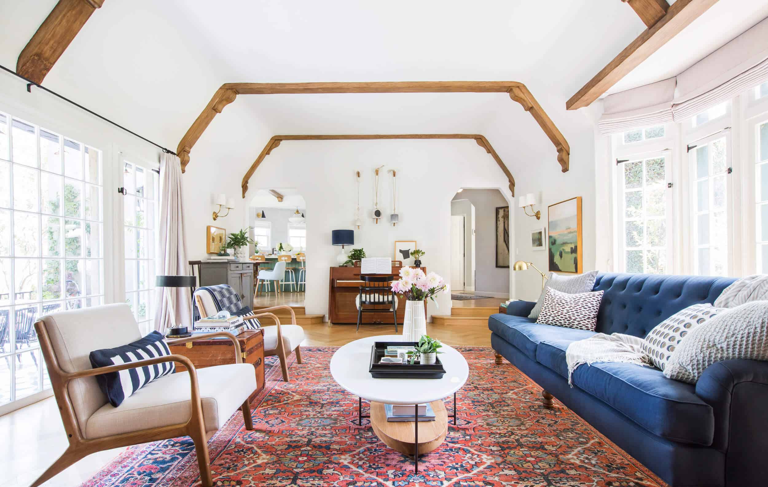
I will do a whole post about the sofa – we custom designed it with Cisco home and it’s now for sale from them – dubbed ‘The Henderson.’ It’s the perfect combination of comfort and formality. At first I chose an english roll arm with a more standard back but then I felt like we were missing an opportunity to do something more beautiful. So the combination of the tufted back, rolled arms, but that deep comfortable seat is perfect.

I’ll take some photos of it without pillows from all angles so you can really see it and give you the full story on where, when, why, how much, etc. We couldn’t be happier with it and we’ll have it forever.

When I first saw that chaise on Jayson Home’s site my inner grandma (who is VERY strong and VERY bossy) insisted it be ours. Our house is old, covered in ivy, in an English style, and it wanted and needed at least one piece of furniture that felt old-world Europe. But that kind of thing can go badly – bad pattern, too much ornate detailing, or just overall old and ugly. I felt that this chaise was perfect because it is just one color (a beautiful sage) and has aged so beautifully, without a lot of rips and tears. When combining 100 year old pieces with more modern ones it’s my opinion that there should still be something fresh and simple about them to mix it more seamlessly. Had this been an insane pattern or more carving/tufting it could have looked silly, but it’s simple enough to work here.
Birdie and I read in this corner every day (fun fact – the bottom two shelves are typically full of kids books, and a huge bin of kids books usually lives under that demilune). We snuggle, read, and I chant to myself over and over ‘why don’t more people opt for Chaise lounges???’ I think it’s because they don’t know how to pronounce it (neither do I), but I’m telling you – if you have a place for it, opt for one over a chair and ottoman. It feels so luxurious and they truly are so comfortable.
That demilune was a Craiglist find for $100 but it was mohogany and super red.We tried to refinish but our guy said that it would always be red, so we painted it. I need to try and find the exact paint color for you, sorry!! I love a demilune and like chaise lounges find them totally underrated. Maybe I should paint my entry dresser that color? Yes, I probably will.

On the opposite side of the room is our vintage piano. Now I LOVE this piano, visually, but I will go ahead and say that it doesn’t have the softest sound. Clearly how it sounded wasn’t a priority to us when we bought it, but it should have been. We are going to try to muffle it a bit with some insulation where the mesh is. Regardless I love it. That chair, while stunning (a vintage Paul McCobb from County Ltd.) is absolutely impractical and we are still on the hunt for a bench so I can properly play this lady and teach my kids.
Any and all tips on how to teach piano to young kids, without adding another battle to fight, would be much appreciated.

Speaking of music, I bought that antique record player at the flea market and it is terribly fun (and EXTREMELY LOUD). You know the phrase ‘put a sock in it?’ Well, that’s from those because the only way to adjust the volume is to shove tube socks in it (or other thick fabric-type stuff).
Lastly our french provincial cabinet that I bought at RoundTop and love deeply. A piece of collage art by Krill Bergart is above it which helps modernize it. The classic Circa Sconce is one that I have loved FOREVER and it is the only one I considered for our house. It’s classic with an edge and totally timeless if you have a more traditional style house.

I wish I hadn’t put the photo of Brian and I there or the big plant because it blocks the art and that could have been a more minimal moment.
The window treatments are from Calico and are just beautiful, with the hardware from The Antique Drapery Rod Company (which supplies to Calico). Deciding between roman shades and curtains (and ultimately choosing both) was a hard decision because of a million tiny things that I’ll tell you about later in a whole post about window treatments, but suffice to say I love them so much.
Am I happy with the room? YES. I truly love it. However … I still want it to be more neutral and calm. I love that rug, sure, but I would rather it be a cooler tone so it feels more visually relaxing. It’s by far the most kid-friendly rug ever (and I have a 2″ memory foam pad underneath so it’s so kushy) so replacing it with something less busy and colorful is hard to do as a mom. But I think I’ve found one (or two). I’m debating between this one and this one, both 11×14. While they are expensive, by the time you get into rugs bigger than 9×12 it’s hard to find anything amazing for cheaper. I’ve scoured ebay, craigslist and etsy every day for 8 months for something vintage. And I found my dream rug from Restoration Hardware but it’s $10k which is just insane (and no, they wouldn’t give a press discount which I thought was odd, considering it was going to be in a magazine). A dark solid isn’t an option because the sofa is really dark, and a light solid is a bad idea for obvious reasons. So one that has a texture and pattern but not too busy and not light but not dark was needed. I used that Dash and Albert rug at the lake project and we all LOVED it in person. It’s so cozy and yet the small pattern is busy enough to withstand most of my kids. I also may have to resign myself to the fact that I’ll have to spend $250 every year or so to clean them. I’m not a perfectionist, truly, but if something keeps nagging me every day, then it’s worth at least exploring the options.
I also bought a piece of modern art to go above the fireplace. Don’t worry, we’ll do a side by side and see which you like more. As much as I love this room, and truly I do, I need to see if I’ll like it more if it were slightly more neutral and had more of a modern edge.
There she is, folks. I’d love to hear what you think and what you’d change if you were in charge of my life (p.s. I would also get rid of that plant next to the fireplace as it feels a bit suburban or something).
If you are interested in this look, here you go 🙂

1. Fiddle Leaf Fig | 2. Woven Fringe Basket (similar) | 3. Sofa | 4. Club Chair | 5. Blue Stripe Throw | 6. Black Table Lamp (similar) | 7. Rug (similar) | 8. Coffee Table | 9. Chest (similar) | 10. Lumbar Pillow | 11. Sun & Moon Pillow | 12. Cream Throw | 13. Linework Pillow | 14. Bud Vase (similar) | 15. Cream Vase | 16. Black Tray | 17. Landscape Painting | 18. Side Table (similar) | 19. Brass Task Lamp (similar) | 20. Ceramic Eye | 21. Woven Pillow | 22. Blue Pillow | 23. Spring Pillow | 24. Glass Table Lamp | 25. Blue Stripe Dish | 26. Matches Holder (similar) | 27. Phonograph (similar) | 28. Vintage LA Map (similar) | 29. Chaise (similar) | 30. Blue Throw (similar) | 31. Credenza | 32. Wall Sconce | 33. Blue Console Table (similar) | 34. Blue Basket (similar) | 35. Cream Stripe Pillow | 36. Abstract Art (similar) | 37. Black Farmhouse Chair (similar) | 38. Black Tall Vase (similar) | 39. Bowl (similar) | 40. Oil Portrait Painting (similar) | 41. Roman Shade & Drapery Custom (Calico Corners) | 42. Floor Lamp | 43. White Vase (similar) | 44. Wood Frame Stand (similar) | 45. Blue Table Lamp | 46. Bells | 47. Black Vase (similar) | 48. Blue Sideboard (similar) | 49. Wall Paint Color | 50. Herringbone Flooring | 51. Black Chair (similar) | 52. Sheepskin | 53. Piano (similar)
Thanks to Real Simple for the shoot and for Target for coordinating it.
***Photos by Tessa Neustadt
For more reveals from Emily’s Los Feliz Home: Powder Room | Jack and Jill Bathroom | Living Room Update | Charlie’s Big Boy Room | Master Bedroom | Master Bathroom | Kitchen & Dining Room | Elliot’s Nursery | Backyard | Closets | Laundry Room | Elliot’s Nursery Update | Family Room Update | Kitchen | Updated Living Room


You really hit the form / function sweet spot with this house. Each image is absolutely lovely but I also want to be in the room, sit on the couch, pull out the Duplo blocks.
I realized recently that I have referenced your work (via blog or Styled book) for every room in my home and every bit of design advice I have offered to family and friends. It is because your spaces and choices make for special and truly livable rooms. Thank you for all your hard work; it has made my own home so much more beautiful and livable!
THANK YOU! So nice to come to the blog at 6am and read a really lovely first comment. Thank you 🙂 xx
I agree. In my house, my husband just refers to “Emily” and we both know who he’s talking about. You have influenced my style tremendously 🙂
Oh my gosh, same here. “Emily” is like “Madonna” or “Cher” in our house.
Love the room but agree about changing the rug. While the current one works, i think the neutral one would make the room more “calming” without making the room too formal. Really like Dash and Albert choice.
Oh, and see, I disagree about the rug. I prefer color in my rooms, and this warm and richly patterned rug makes the room welcoming and inviting.
The tradition implied by the type and pattern of rug will provide some calm all by itself.
PS. I love the room, Emily!
The space looks amazing, I am so drawn to that gorgeous oval coffee table!
http://www.shopthecoconutroom.com
I really want to love this room. The furnishings are perfect. So practical and cozy. It really, really makes me wish that you’d put a color on the wall. To my eye, wall color would add that old world depth and warmth. Please pull a color from that lovely rug and repaint.
Ha. I love the color (its strong white by farrow and ball). It feels bright and open. xx
Oh, no way! It feels so fresh and bright.
I disagree. The room glows with light and all the beautiful items in it get to be the stars. A color on the wall would dampen the light. Also, where would one stop with color between the wall and ceiling? Those beams need to stay far away from anything but white.
This room is a wonderful example of how we can all have beautiful things in our lives everyday and actually live messy, fun, rambunctious, practical lives.
I love the white walls! Especially with the wood beams.
Also Emily – just want to agree with the above comments that you influence me so much – in the best way! And my husband knows you by name too haha!
True, true — Clear evidence of Emily’s effect on my style is the fact that most of my walls are now WHITE (with colorful paintings). It makes me happy & calm.
I agree with Kirsten. Maybe in person it feels less stark?
achingly beautiful!
YES – well said
I love this room, it feels so homey, which I think is the feeling you were after. However it does lean towards busy when looking at it as a whole, even though the vignettes don’t seem so. While I am sad about seeing the rug go, I do hope that you find a cooler toned Heriz, or other Persian style rug, as I think the movement adds so much to the space.
I think what throws the room slightly over to the busy side in the whole room shot are the book niches by the fireplace. I realize you need storage, but they feel a little visually chaotic. For sure that’s not an easy fix, and really who cares! The space is completely livable in the best way. Good luck with your tweaks, whatever you decide to make. I’m certain it will continue to be striking, and I’ll be here to follow along. Keep up the amazing work!
You put into words what I have been feeling, I have not been able to put my finger on it but you are right. I love the little moments in the room and I love every other room in the house but I have always felt this room was busy. I just think back to the shelves in the old house and they were a show stopper, these just look overloaded. Overall the room is gorgeous though and I would kill for all of that natural light.
I have to agree with this as well. The book shelves and how they have been styled make the room look busy. I agree with Emily on a more neutral rug as well. The view of the room with the piano and looking into the kitchen is gorgeous! It’s still a stunning room 🙂
I’m also not a fan at all of those heavy, busy bookshelves. They’re so opposite compared to the gorgeous shelves in your last home, which were like a master class in styling shelves in a clean and calming way. What’s the rationale behind these shelves, Emily? You didn’t mention them in the post and I’m very curious. I understand the function over form philosophy you’ve got going in this house, and I get that you read children’s books everyday but surely you don’t use the novels and other items on the shelves regularly….
I also agree that another calmer Persian-style rug would be gorgeous in here!
I’m going to throw in a different opinion here. I actually LOVE the bookcases and the many objects/books on them! I feel they offer a certain “personality” to the room and it provides a place for the homeowner (in this case, Emily) to display things that bring back memories from travels, a favorite gift from someone special, etc. I do styling work myself and have many clients that prefer a clean, modern look with minimal items “obstructing” their view….they just find that look more appealing. That look makes my job easier and I appreciate their preference but at the end of the day, I am never drawn into a space like that. In the end, if you have a small space, you must be much more careful about visually breaking it up with too many places for the eye to rest but in my opinion, in a large room like Emily’s, I will take some visual interest any day! My own living room is 15’x30′ and I have a wall on one end of it with a couple of floating shelves which house special art and other objects that make me happy. That wall never fails to draw new visitors to my home to it and there have been so many great conversations started around the inlaid box from Cape Cod or the carved picture frame from a vintage store in Austin!
I see what you’re saying, but I am going to speak up on behalf of the books. It pushes more towards English Tudor/Library feel than California, yes — but I like this look. (The only piece of design advice my mother ever gave me is “books are the best decoration”!)
There are SO many things I LOVE in this room that I can’t possibly list them all! Loved seeing them in print in Real Simple too. I love the rug!! To me, it’s timeless and a lovely juxtaposition with the modern pieces. Of course you should have what feels right for your own home! But I am saving the photo to my inspiration folder before that rug is gone. Nice job, Emily!
I love the room and I love the rug! It inspired me to purchase a rug that has a lot of pattern and so far, we love it. It’s not wool but a durable premium polyester made by Karastan. I have a friend who is very allergic to wool and also, since we have babies rolling around, I wanted/needed an alternative. However, we almost purchased this rug by Dalyn: – http://www.rugstudio.com/dalyn-toro-tt100-denim-157988-area-rug.aspx in a 9 x 13. It’s a beautiful wool and viscose rug. I saw it on display in a carpet/flooring store) and looks a lot like the Dash & Albert rug you are considering but less expensive. I also have to consider what works for a family member who has mobility issues, which complicates a lot of decisions I make.
You did a great job balancing comfort, beauty and practicality. The room just draws you in, which in my unprofessional opinion, should always be a goal.
What a great price for that rug! Sadly I need at least a 10×13 (which is the size of my current one). Ideally a 12×15 … But that is a great rug to know about. thank you!
Emily– from a loyal, everyday, longtime reader (but first time commenter!), you have truly outdone yourself. I could stare at this room all day and find more surprising genius in it each time. It is STUNNING, and how carefully you have considered the form, function, and purpose of each piece, mixed with the masterful beauty of blending modern and classic is truly what makes you an expert, artist, and inspiration all around. The whole home I’ve felt like this, but something about reading the room reveals piece-by-piece has made it even more abundantly clear why you are such a respected star and why I keep coming back to read the blog every single day years down the road.
I know there have been some ups and downs with blogging, but your voice ringing clear through these posts and the house and sharing your tangential thought processes (some of them from the kitchen post made me laugh out loud) plus your honesty about mistakes you’ve made or why you chose one thing versus the other sprinkled with the heartwarming love for your family that rings so clear — keep it up! (Make that sound less like me cheering at a six-year-old soccer game-sounding…) But in all seriousness, keep it up – this work is absolutely brilliant and I am so happy that I stumbled upon your work years ago. Thank you for all that you do, and especially for creating absolutely perfect rooms like this one. I’m just blown away!!!
Ah, thank you. So so so so nice. I can’t thank you enough for your comment and it has totally started my week out great. THANK YOU. xx
Have you tried to flip the rug over? That can be a great way to soften the look without getting a new rug. This room is beautiful!
You know someone suggested that recently for a project but it just felt weird to me. Agreed that it would mute the colors, but its like a book facing spine-in. I don’t know! also wouldn’t be nearly as soft. xx
For what it’s worth, I flipped a Persian rug by necessity and I’ve been very happy with it! I ordered my rug from eBay because it was pictured as a beautiful faded red, but when it arrived it was the color of puke. I think it had been artificially (and badly) bleached to look old, because on the back it actually was faded red. I didn’t have any more money to spend on a rug, so I flipped it over and called it good enough. And it’s actually worked great — it’s under my dining room table, so having a flat, mat-style surface instead of a rug pile has been perfect.
This is the first white walled room that didn’t scream “Unfinished” at me. Love it. It will probably lose something for me when you change out the rug, but the room has to work for you and your family.
The BEAMS! I’ll admit that I thought you were crazy not to do the “window frames in white, with the windows themselves in black” option with black beams. That’s still what I would have done in this space, but what you did is so much you.
Basically this room feels like the perfect mix of California casual and English Tudor.
AHn, thank you! It probably helps that its not a true white. It’s strong white, with bright white moulding and its a really soft stone color. I lOVE it. And thanks for that last sentence.
You’re still supporting artists even if you buy from a mass retailer like Target. I, Pamela Munger, did that painting (titled ‘October’) and am thrilled that the general public gets a chance to buy it. It looks fabulous in your room, Emily, and I so appreciate not only your general style but especially the way you bring art into all of your rooms and often make it a center point. Thank you!
So cool!
It’s beautiful!!! I’m going to go google you right now!!
Yay, Pamela! I love it and I”m so glad that a person did it and that Target is supporting smaller artists, too. I’ll update and credit you!
This is awesome 🙂
Thank you for commenting about your art. I’m off to google you and see if you have a website. it’s always fun to find new artists. I love this painting and I think it fits Emily’s aesthetic wonderfully. Emily, I love this room, I really like the current rug, the other choices are nice, but too predictable in my opinion. Keep on with your fantastic work.
So happy that Pamela spoke up, I was trying to find out on the Target website who was the artist. Yea! Thank you will be checking in to your website.
This is so cool. I really love this painting!
I was wondering if an artist didn’t create that magical piece of art, how did it come to be..? I looove it Pamela! (your painting is my favorite item in my target shopping cart ; )
so funny, I recently purchased a few of Pamela’s pieces and when I saw this art in the post I thought it reminded me of Pamela’s art…. so glad to know, thanks for letting us know Pamela. Love your work!
Pamela (and Emily,) I just bought this painting a few days ago and it’s hanging over my fireplace now!! I love it SO much! It is so beautiful. The colors are just wonderful and harmonious, and the composition is perfect. I am an artist professionally, too, but I love supporting other artists when I can and when I see work I love. I was hesitant to buy this piece even though I quickly fell in love with it ( and ONLY because it was coming from a big box store–the holy grail of big box stores though, of course) until I read your comment that it’s still supporting you as the artist even if I buy from Target–and so I did!! AND It says your name on the reverse side, which I was SO happy to see, too. Anyway, beautiful work, Pamela. I’m so thrilled with it in my home. So so thrilled. I’ll be watching your Etsy for another. 🙂 And stunning room, Emily!! Thanks for being a inspiration to us all!
If you end up selling the rug I’d love to buy it! I’ve been looking for one just like it to warm up my
living room.
Same here! Although sadly, it’s probably not in my budget. I love that rug!!
Love your whole house, it’s beautiful.
I’m anxious to see the new art for above the fireplace. The current piece is my least favorite thing in the room. A gloomy painting of a strange man staring at me everyday? I get the style of art for the space, but I don’t get what feeling this evokes for you or your family when you walk in the room.
The room itself is gorgeous, you really brought out it’s beauty. I love the wood beams so much and the mix of furniture styles keeps things from being too traditional.
The only other thing I don’t care for is the rug in this space. With the blue decor, it’s too Americana. I do wish for something more modern, more color added to the room. A hint of your older work, before things went neutral and blues. Just a difference in taste really, and your decorating talents are always apparent. It’s a beautiful room.
I might need to take back my thoughts about the rug. When I first look at the overall room I see red, white, and blue. But looking closer at the photos the rug has so many beautiful colors in it, and is hinting more orange vs. red, which is all probably more obvious in person. Still, always fun to compare with other options.
Well, you are in luck because those are the two things that we are switching out! The rug has a lot of pinks in it, actually. But yes, it is hilariously red/white/blue.
I know you’re trying to source another rug, but the traditional pattern really adds so much to the room, IMHO. The tufted sofa plus the rug, plus the modern Target chairs and the modern coffee table just feels so rich and layered. With those windows and all that light on the walls, I really don’t feel like the rug is too dark, particularly against the light oak herringbone floors. Just LOVE LOVE LOVE this room!
I totally agree. A more modern rug would make the rug more typical. Can I also say that my current sofa purchased in 1994 is dark blue and the same lines? Early on, I had a rug similar to yours but in rust navy and gold. I love seeing these traditional rugs mixed with modern these days and I’m thinking of getting one again after we reupholster the old couch again.
Thanks Emily! I loved those circa sconces so much and bought 2 for our house! Everything looks good! I am so obsessed with that English arm roll couch.
This room, while beautiful, feels a bit busy. I wonder if you would get a more basic rug (even more than the 2 you are looking at)? We have this one and have a 2 year old and baby and it’s holding up really well! http://www.serenaandlily.com/diamond-jute-rug/m10217.html#start=23
Just a thought!! Thanks again for everything!
I like that rug but its the same tone as the floor (the flooring is pretty light). So a cooler color would be better, but it looks like that one would hold up nicely. We’ve thought about a solid gray, too, but then there would be a lot of gray and working with the curtains (which have a bit of purple in them) could be tricky.
Funny you said that, because on my screen the curtains look more purple than gray. Of course, lavender is lovely with red. I wonder if a neutral rug will make the curtains look MORE purple.
So much to love in this room! The rug is so timeless and practical I think you should keep it!
If you want it to feel more modern, maybe just take down the big antique portrait over the fireplace? The negative space will make it feel cleaner, right now it’s something of a focal point and if it was gone I think your eyes would focus in on the coffee in the center of the room and naturally drift out. Just a thought, and as always, it looks great!
oh, an excellent idea! no art over the fireplace magically balances this gorgeous space and allows your focus to shift so the room emerges as a whole -beautiful! (at least to my eye/in my humble opinion/what do I know.!? : )
Emily, i love that your design here feels so cheerful and welcoming without sacrificing beauty, comfort or (quite likely most importantly) livability. it is refreshing to see such a lovely designer space that feels less ‘created just for Instagram’ and more like a ‘real life happens here’ moment. thanks so much for your continued inspiration!
OOOO what a good idea! I would LOVE to see it without any art.
Emily, when you show us the comparison (current vs new modern art) can you also throw in “no art”? I bet that would be lovely and serene.
I need to know about the memory foam pad for your rug. That would change my life!
Me, too! Memory foam for the win. I’m all about making the rugs more cushy for my crazy toddlers. (Mom, watch me dive head first from the couch on purpose. Again.)
I bought two of those Rodney chairs but returned them because they felt solo small. I regret it because I love the look and I check online everyday and they have yet to be restocked. Tell them to make more because i need a pair for our master.
I love it, and I think a more modern piece of art over the fireplace would be even better! As for piano advice, I have always heard that when a child is just starting to learn to read is also the moment a child can learn to play piano. You are waiting for the two halves of the brain to join correctly and before that moment it just isn’t going to happen. It’s all physiology! I think learning to ride a two wheeler is also linked to that brain development. I’m a former teacher and I’ve seen this is generally true. So probably first grade, but maybe sooner or later depending on the child. I’ve seen many children who could not read in second grade suddenly make a shift and read well in third grade and go on to graduate near the top of their classes. So no need to worry if if happens later. It’s just brains growing!
OOh thats so good to know. my friends that have their kids with a teacher now just have fun. They pretend to be monsters and slam down the keys. We are just fiddling around now and I think its a good start. A lot of me playing, them pounding along ….
Hi Emily-
Gorgeous room! You mention a memory foam rug pad. Where is that from? I am looking to both make my rugs more comfy and protect my 125+ year old softwood floors. Thanks!
Stephanie
I’d like to know this, too. While a 2″ thick memory foam pad sounds so cushy, doesn’t it make the rug a bulky tripping hazard?
We just buy the ugly foam rug pads they sell in a roll at Home Depot. We cut them to the size of our rugs and it doesn’t make them bulky at all, just nice and cushioned with no slip.
So I watched your instastory on the cabin and am so excited to see what you make of it! One note of what I hope would be considered constructive feedback: It was so fun to see the house, and presumably, your followers all have a good eye or interest in current home trends so we don’t need anyone pointing out how “tragic” the bathrooms are or how hideous the house is. Frankly, it isn’t so bad (but full of potential!) and I would estimate that at least 2/3rds of America have bathrooms just like those or worse. Also, pointing out how crazy! it was that you all liked the wall to wall carpet when we all know carpet is just for the plebs, just came across pretty snooty.
It is entirely possible to talk about all the fun possibilities of a place without showing disgust for the current design. Disgust should be saved for actual things that are dirty, not in showcasing a house that is far nicer than most Americans’. I love your site…just don’t want you to alienate yourself from your audience.
I’m pretty good about framing things so people don’t feel bad. saying something is ‘not my style’ or ‘dated’ when its 20 years old/builder grade I don’t think is surprising or inaccurate or offensive. But i’ll definitely be sensitive. xx
I think you do a great job at being sensitive and updating. We all know have our opinions and we don’t always agree with your choices, but we usually agree when you say that something needs to be updated. My house isn’t perfect and there are bits that I’d change. I’m not offended when you aren’t “team builder grade.” I am a bit more mid century and prefer the style of your previous house once it was staged over the current, but it works well with the house you have. You do you and don’t worry about being sensitive….people can find another blog to troll if they don’t like it…just be the Emily that we’ve all come to love!
Hey Emily! I love following your blog and have for years. I recently purchased a rug from this Etsy shop and think they’re so affordable and come in many colors, including blue like you’ve mentioned you’re looking for. You said you’ve scoured Etsy already but I figured I’d share, in case! I don’t have any affiliation with them, just a satisfied customer 🙂
https://www.etsy.com/shop/salaberna
thank you! My issue is size. I need huge, like 11×14 or 12×15. so challenging. So i basically just search via size…. xx
I still think someone needs to get this rug. It’s 12×18, roughly $3000 including shipping, and lovely 🙂
https://www.chairish.com/product/495981/oversize-oushak-handwoven-oriental-rug-12-x-18
Maybe it will work for you, or maybe someone else will want it? I don’t have any connection to the seller, I just think it’s a good price for a nice rug. I don’t have the space or the money, alas.
I think what I like best about your style is that you make no apologies about using Target items in your own home. Yeah, I know you’re a spokesperson for them, but you actually seem to love their stuff. Not everyone can afford high-end pieces, and it’s nice to see a professional using more affordable pieces in their own home. And when you mix them with original, unique, hand-made, vintage items, it all comes out so beautifully. (PS I LOVE the Dash rug. Would be interesting to see how it changes the look of the room- with a more modern fireplace art piece.)
Oh I love this room and all the natural light! What a treat for you and your family. You knocked it out of the park!! My only edit might be to swap out the light fixtures that currently flank the fireplace. I think breaking up the expected route of “double arm” sconces encircling the room would snazz up that wall a bit. The sofa is a dream!!!!! that fabric makes me swoon, right onto your perfect chaise!!
It’s a beautiful room! I want to like the two rug options you mentioned but I just don’t fit the space. I think something more in line with what you currently have with muted colors would be better. Don’t get me wrong they are both gorgeous and if I had to pick I’d go Dash and Albert…but I say keep looking;)
I like this room a lot, but to me, compared to your other stuff, it isn’t quite there yet.
I like the rug, it feels right in that kind of house, and it counterbalances the weight and detail of the beams. To my eye, it’s the wall scones that are throwing this off and making it less calm. Is that weird? Because you have that visible design of the chimney I think the scones make for too much ornamentation at that level, and the room never settles. If you take away the wall scones, and then settle the room one more notch – maybe a black trunk instead of a brown one – I think that would keep what’s so great here, the originality and layers of history, and get you the calm feeling you so often attain in your rooms.
As usual, I’m left wanting to buy up all the Target merch thinking my house will look like yours. Beautiful blend of old and new, expensive and affordable.
I also admire the use of roman shades on one side and full curtains on the other. I look forward to your window treatment post!
I’d also like to comment on how much I love the new posts being posted first thing in the morning. They always pair well with a cup of coffee.
I vote for the the Serena & Lily rug! I agree about the plant by the fireplace. Maybe add a basket for texture under your demiluje to hold books. Anyway, I love it!
Congratulations Emily! The room is really beautiful… so cozy and lived-in in the best way possible. However I think I agree with you about the changes you’re going to make. Although the existing rug is beautiful, I think I’ll also prefer a softer one and I like the Homer Blue Loom Knotted one you’re considering. And I also think more modern art above the fireplace would brighten the space. It’s nice to see that an amazing designer such as yourself also needs to tweak a room here and there just like us “regular folk”. Can’t wait to see the updated version.
PS: I cannot wait to see what you do with the cabin!!!! So exciting!
This turned out so beautiful. Mostly, I love the foundation choices you made during the renovation (floors, beams, doors, windows, and hardware). I love the current style, but can’t wait to see how it evolves as you change items out. I have used the color ‘Compass’ from the Target paint line for an antique dresser, and it sounds like the color you have described using to paint the entryway dresser. Just a thought!
I really like the rug. I think it marries well to the brick fireplace surround and the warm wood tones. It’s perfect size and style for the room. It’s a good foil for all the blue accents, too. If you don’t find something that makes your heart sing, the current rug is a really good option.
B.E.A.UTIFUL. This is gorgeous! Can’t wait to hear why you chose both Roman shades and drapes, though it looks beautiful! I just never would have thought of it.
I totally love this room. But you’re right, the only part that looks like a bit of a misfit is the red rug. Largely because I don’t think it’s you… though I only ‘know’ you from this blog! I saw the rugs you’ve short listed.. I love the colours but not the pattern. I love the pattern on this rug but not the colour. So though it’s probably easier said than done, I’d find a rug in this vintage pattern with those colours… beige / blue / grey. All the best with that! 🙂
Nooooooooooooo! I love your Persian rug. :(( But if you have to, the Niles rug. The room is beautiful as always. Thank you for your spirit, your life and work that you so willingly share.
Huge fan. Visit your blog every day!
This room is lovely. Such gorgeous bones. It’s coming together great.
To me, something is off about the fireplace wall. I agree with whoever said the book niches look too busy. I think it is because the shelves are too close together. Being unable to vary the height of objects makes it look busier. But I think they also need something to tie them stylistically to the rest of the room. I can see two directions: find a way to incorporate them more with the fireplace or replace shelves with a chunkier board in tones of your ceiling beams and increase space between shelves for a more modern look.
Your house is stunning and I love what you’re doing with it!
This is a fabulous idea- re: shelves that match the beams. I can absolutely picture it and it would be beautiful!!
This room is really beautiful and, to echo many of the other commenters, hits the lovely/livable sweetspot. It is textured, layered and inspiring in many ways. OK, so there is a tiny but… while the chaize is beautiful, that FRINGE conjures some pretty scary flashbacks to every friend’s grandmother’s 1980’s mauve floral living room set with matching velvet drapes. I can actually feel the backs of my thighs sticking to the vinyl sofa covers. While I totally respect your stubborn inner grandma, and could see how a small dose of eccentric-quirky grey gardens could be fun, those tassels fall (in my humble opinion) firmly in the creepily-offputting grey gardens camp. Wouldn’t the chaize better fit your criteria for balancing traditional & vintage with updated & clean-lined if you removed the fringe and we had a little air to breath underneath that baby?
I hope it is obvious that if I only had one small feature to critique, that I overwhelmingly love all the other choices you made here. Thank you!
There is so much character in this space I’m amazed that I’m not overwhelmed by it. I totally get what you’re saying about the rug though. I love it so much, and I think that is always my flaw. I fall in love with a specific piece and I just really try to make the room work around it even though it doesn’t work for the room… But, I mean I’m not expert but I’m not confident it’s so much a colour issue as a weight issue. This room has the potential to be so open and and bright and fun and that rug has that potential too – but with the room and the deep colours in the furniture and the darker beams and all that pattern in the rug, it’s sortof like the bottom of the room feels heavy somehow? The white in the cushions and on the coffee table definitely help, and I see what you’re trying to do with pulling that navy into the rug again to ground it but I think it’s going to be too matchy matchy? I’m wondering if something with a bit of a lighter colour thats super cozy and snuggly like the rug you had in Elliot’s nursery at your old place wouldn’t pull things together in a bit of a lighter way and make things feel like a bit more like cozy instead of dark/heavy? Just a thought. Love the room though. My favourite is that piano I can’t get over it.
Also, a small request. How do I put a chaise in a room? How do I know when it will work. I can more easily picture a chair and a stool and how that fits into a room but I think I have a place for a chaise and I think I would prefer one I just don’t know how to know or how it has to be positioned in a room…. This is not a well articulated question but I’m hoping you’ll follow. Would love a bit of information maybe on scaling and placement of this piece (or maybe even in general!).
Thanks!
First, I love everything in this room. It truly is the sweet spot. I do have one question, how do you reconcile the tonal groupings your have going on both sides of the room. For instance, it looks like on the side side there is a strong color story of blues and greens (sofa, chaise, demilune, blankets, pillows, baskets, a large amount in the framed art) and much stronger wood tones on the other side between the chairs, credenza, and trunk. It might be neurotic but I always feel like if I put a large green thing on one side of my room then I need to put something in the same color way on the other side for balance. You’re such a style queen, it makes me feel better knowing that it looks beautiful in the end, but I just can’t seem to shake the need for color balance. Any thoughts and suggestions?
Growing up, professional rug cleaners came *every* year to clean every rug in the house. It was a pain, but entirely worth it, and each year we would all collectively realize “wow, those were dirty…” once we saw how clean they were. I support your rug cleaning. 🙂
This looks great! And so good to hear it is functioning so well for your family!!
I think the bookshelves would actually look better filled completely with books. Maybe leave the functional baskets on the lower shelf, but I think in this case the different frames, vases, and books- all being around the same size seems busy. I think all books would add texture and color, but let your other vinettes around the room shine.
I do love books though!
Love you, your team and your style. There are so many elements in this room that are working., but there are 3 areas that are tricky.
Overall, to my eye, it’s an incredibly busy room and I’m unable to rest my eyes on something. The fireplace wall is tricky because there’s already so much detail with the beams, the scrolls on the beams, the scones, the curvature of the stucco fireplace, the brick and then the extra added art and business of the stuffed compact bookcases. It’s a lot.
The other part is the busy rug which is off center to the fireplace wall. If the rug were centered to the fireplace would it be any easier your eye?
Lastly, the room feels crowded. Seems like you could remove that demilune piece and get a little breathing room. Same thing with the heavy trunk getting swapped out for something lighter.
Good luck and can’t wait to see where you end up!
Re: piano lessons: my daughter is in 3rd grade and she just started piano lessons a month ago. We held off until we knew that she’d be excited about it and willing to stick with it. (There will be no quitting piano lessons for her!) We found a piano teacher whose personality works with hers. My daughter loves her piano lessons and I don’t even have to ask her to practice. Her teacher said its actually nice she started when she’s a little older because older kids are easier to teach (i.e.-older kids can read and they are more coordinated). Find a teacher your kids will love! It worked for me (I played from Kindergarten through college) and so far its working for my daughter! Good luck!
Emily, your work is amazing and your book Styled has such helpful info. The room is lovely. I agree the rug is busy and have thought maybe a bigger pattern, same colors, would help. Also, instead of the sconces over the built in book shelves: Circa Lighting’s 18inch cabinet maker’s picture lights in brass. The chaise, I just can’t get sold on. Wingback chair and ottoman would do the trick and add some height to the room. There are so many WB options/ideas out there today. They are a great fit for your English tudor home, and did you know they were designed to keep the smoke away from the fireplace? If you keep the coffee table, move it and the couch toward the chairs, and I think a gray couch. Ok, now if I could only do my own house 😉 Keep up the great work!
I do like your living room. Especially the sight if you’re standing in front of your fireplace looking towards the kitchen. But I believe that I will like this room even more after you made the changes you are planning to do.
I love, love, love the room and especially the rug. Please don’t change the rug! But it would definitely be interesting to see a more modern piece above the fireplace. Great job bringing it all together!
So many great things happening in this living room! For a more casual and modern look I would love to see the Safavieh Cape Cod Handmade Natural / Blue Jute Natural Fiber Rug (10′ x 14′) in this space.
You could bring in more sage and olive accents as pillows on the armchairs to harmonize with the landscape art and the chaise. I would also like to see a pop of yellow or two.
I agree with the previous comment that the bookshelves would look good styled with books from end to end…finer grained styling doesn’t seem to fit as well in such a large room.
It’s so funky and fun but also so truly inviting. I get the pull for something more neutral and I am excited to see those tweaks but it’s totally great how it is. Couple of things, the plant by the fireplace comment (a little suburban – bahahaha!) and secondly, as a mom to a toddler I would be stoked to have a play date here: I’d make him take his shoes off but I wouldn’t let him have a juice box in here – perfect balance in my opinion.
What Paint color did you use in your living room? It’s lovely.
I love the geometric patterns on both of the rugs you have selected as alternates but both have a high content of viscose in them. While viscose makes for a soft rug, its really not a good choice in high traffic areas. Even water will leave a stain. You have done such a marvelous job of making your “formal living room” such a user friendly space it would be a shame if the rug didn’t do the same. While the middle eastern rug looks wonderful I do agree a more modern rug would look more youthful.
Please please sell me that rug! The room is gorgeous and I love that sofa and coffee table combo!
I really love the way this room turned out. The couch is perfection and I personally am in love with that rug.
To my untrained eye, the busyness comes from the fireplace wall. From the angle of the photos there are too many sconces competing with each other. I love those Target chairs and had them picked from my living room refresh. Hoping they come back in stock. As a mom of a filthy, rambunctious little boy, a dirty dog that spends half his time in our yard and one-on-the way, I love how all of this is made for your real life. I really like how you used the roman shades and the drapes. I can’t wait to read your entire windows post, because I have some decisions to make on curtains myself. This is my favorite room so far besides Birdie’s room.
Please do not replace THAT rug with either of THOSE. Vintage/Antique Persian is the only rug meant for that room. It just WORKS. Also PLEASE do not replace that antique portrait painting with modern art. I die every time I see him hanging there. Although…if you decide you don’t want it I collect strangers for my walls so send him on to KCMO. Happy to finally see a full run down of the room. Great job!
I 100% agree with this. The rug and the portrait painting are two of the strongest pieces in the room. Love the character and depth they add.
I love the two suggested rugs but probably not for this English Tudor. I’m concerned that their style would take you back to the style of your previous house. I love nearly all your choices and the arrangement is brilliant.
Agree about the plant in the fireplace your comment was spot on!
For the bookcases how about painting the back in a warm stone colour to take some of the busyness away by reducing the contrast.
There is so much about this room to love! Am I the only one who sees a layered rug situation here? A big sea grass with a more neutral persian rug seems so perfect? I know the floors are insanely gorgeous but you see those elsewhere in your home so I think it would be okay to cover them. Maybe you have spoken on these before and hate them? Anyway, it just feels right to me in this room. And, I think modern art could be really fun too (although I do love the old man). Enjoy your wonderful home!
the room looks really, really good! so cozy & comfortable – not so staged, phony-designer. BUT, the COFFEE TABLE is WRONG, WRONG, WRONG!!! i was one of those thousands who hated your former kitchen counter chairs, so i know what i’m talking about! 🙂 the rug would work if that table was GONE!!! those other rug choices are not IT! ditch the table, find a great one, then see about the rug. please!! a more solid table that is heavier looking and that doesn’t have such a low shelf, or no shelf at all. plus, it looks too small. maybe there needs to be some simplifying & then you’d like the rug…. yes, ditch the plant. too rounded. plus you live in ca. with all those windows. seems like a plant indoors is unnecessary.
I agree with Emily on the rug, but maybe a table similar to this?
https://www.potterybarn.com/products/parquet-reclaimed-wood-metal-coffee-table/?pkey=ccoffee-tables&isx=0.0.1100
That is my first thought too. I’m surprised others aren’t reacting to the coffee table more strongly. To me, that is the first wrong thing and has to go.
Love this room and your updates will be exactly what I was thinking as I read through the post. The room is beautiful, but feels busy, the new rug and art will make it more calming. Also, the legs of the coffee table are lost within the pattern of the rug. I’m kind of liking the second rug more because it’s not more blue. Those chairs are amazing and so is the couch! Looking forward to seeing what you do with the updated items. 🙂
Hi emily!!
I love your style!!
I just feel like this room is soooooooo busy!! I feel like I can’t concentrate. There’s a lot of pieces and things that I love, but I feel like I can’t focus on any one thing because theres too much. Maybe it is the rug! Or just so much going on? I don’t know! I would definitely change the rug for sure, because it just adds so many different colors and I think you need something more calming. Its so so so so so busy!
With that said, I love so many of the details and I love the target pieces FOR SURE!!!
Love this room so much! So welcoming and cozy. As far as piano goes, we have loved Hoffman Academy, an online (basically free) video lesson for kids. It’s very high quality and perfect for young kids before you’re ready to commit to finding a teacher. My kids are always begging to do more! The teacher is great at making every exercise into a fun song and does adorable finger puppet shows at the end of the lesson. We just set a tablet up at our piano and watch and play together.
What a lovely room. You can tell a happy family lives here!
I like the rug, and personally try resist the urge to keep changing things (pointless quest for perfection and all that). Also the thing I love about your design style is that it’s NOT too perfect, and your personality and the real-life way your rooms are used shine through. But then I’m not a designer and no one picks over my decor choices.
The French pronunciation of chaise longue (long chair) is “shezz long” (there’s no “lounge” in there). But I notice Americans usually say it “chase lounge”. If you don’t want to sound pretentious but also don’t want to pronounce it wrong, just call it a long chair or a lounge chair.
If I were in charge of your life, I’d tell you to keep the darn multi color stain, spot and litter hiding rug and forget replacing it. In ten years, if you still want to, the kids will be older and hopefully less spot producing. And forget ever serving red wine again if you go with the other rugs. This one will swallow a spill or two without telling anyone…
I bought Real Simple today. I wonder if they’ll have an uptick in sales this month from all your fans?
I have worked out (I think) why that rug is not quite working. It’s too big for the room! I think those kind of patterned rugs are better in small doses – they are like artworks for the floor (or walls too if you like). For a large rug to anchor furniture I think you are probably right. Something a bit more neutral. Having said that what you have is a beautiful rug and very practical with small children.
I love, love, love this room!! Please call your Target source and get those club chairs back in stock!! I NEED them in my life!! They should be a permanent part of the Target inventory like forever……
Ohhhh….and that painting….is amazing too!
I glanced at the comments and it seems I may be alone in this but for me, it’s the Target chairs that don’t work. I think something that’s grounded would look better than all that open floor space. Not sure if I’m explaining myself well but it’s like all the furniture – except for the chaise – is wearing high heels. I think a couple of leather club chairs (not the oversized ones) would look good and be very kid friendly. I didn’t care for either of the replacement rugs. I liked a lot of what you’ve done here though! Decor is an ongoing process, isn’t it?!
I realize you already own the piano, and this isn’t local for you, but the matching bench!!
https://minneapolis.craigslist.org/hnp/msg/d/mid-century-modern-baldwin/6310995882.html
I always love everything you do Emily! This room sure does seem cozy and there are a lot of great pieces! It’s maybe a little too old world/ vintage-y for me and I do agree that the bookshelves, sconces and rug make the room a little busy, but, it’s your house and everyone’s style is different! I just love you, and really enjoy reading your blog because your sense of humor comes across in your writing and it’s great! Question though! I know your kids are not babies anymore but do you ever cover the brick area for safety? I nearly died from cracking my head open on a brick fireplace when I was younger so they always makes me nervous! I ask because we are house hunting and come across houses with brick fireplaces often and I wonder what you can do to make them safer if we were to buy one. Thank you! 🙂
I love how lived-in this feels, even though you haven’t lived there for that long. You’re great with mixing in antiques with modern items with nothing feeling stuffy, just comfy and bright. I can’t wait to see a more neutral rug in there. The current one is beautiful but a neutral one would feel lighter.
So I noticed the fiddle leaf fig is faux. I love the idea of a faux tree and I think the quality is much better now when bought at places like PB instead of the home craft superstore-type of place. I always worried it was tacky to have faux plants/trees, but are they OK now? Any dos and don’ts re: fake plants?
It looks like a real home…very comfortable and I love that you considered your own person family’s needs!! And I do like it in general but it seems too English traditional…not unique enough. Id love to see it with a more modern simple rug, modern art above the fireplace and a few less décor pieces (like the tall lamp, tall vase, tall fiddle leaf…let the book case shine a bit more!)
I love you, I adore you, I talk about you to my wife as if you’re an old friend, I come every day to your blog, I have used so many exclamation marks on so many different posts… this one needs more work. I also have the same dilemma with the RH rugs, they’re ideal but too expensive. But I cannot unsee them in this space, I think you might need one. The shelves next to the fireplace need to be – wait for it – only vessels/frames I think. If it was only books it would still be too busy. The sconces over the shelves should be something looking downwards, like painting lights but larger. The only non-traditional pieces are the two chairs and the coffee table, and everything else is very traditional, both in color and in mood. The patio is so exquisite, I wish you could bring more of the gray-blue and black combo into this room, and leave behind the red/sand/beige. I’m sorry for writing such a negative comment, but I do feel that I care so much, I’m so invested in you now, that if I didn’t I wouldn’t be a good virtual friend… if that makes sense!
I agree. I love love love your style and I read this blog every day but this one leaves me scratching my head. But I’m glad your family is enjoying it, that’s the most important thing! And I think the most costly things are amazing (the floors, window treatments, and the couch) so with some scaling back of accessories and a tighter color scheme, it will work! I think the rug is beautiful, but I really don’t like it mixed with the other pieces, so I’m glad you are replacing it. BUT you are AMAZING and I think this will come together in a more organic way as time goes on and you try different things. So I hope this doesn’t come off as a negative comment but more as someone who is looking forward to seeing other things from this space as you gave us with your last home. <3
Oh Emily, I ❤️ your style. LOVE LOVE the coffee table. The current rug is too much for my taste, I vote for the new cream/navy rug.
Piano tips: I do better having a teacher than teaching my kids myself because the teacher knows a lot more and it adds some accountability. We do piano practice right after we get home from school (and before movies) so it’s part of the routine and my daughter expects it. I also help her with practicing and try to be more supportive than nagging. I like to let her practice what she wants to first. We don’t have a time limit and I don’t try to force it. So far, it is going well, but we haven’t been doing it for too long either.
Beautiful! It’s probably because I have a very similar vintage rug but I am sad to hear the rug may go. I get wanting something more modern but in a family friendly English cottage – this is it. I think a modern piece over the portrait on the fireplace will work great. I love it.
We just bought a new house and I’m trying to figure out window treatments all over. I’d love a post about window treatments to hear your opinions/preferences/expertise. Your neutral paint color post was very helpful in picking paint colors and I love all of the navy accents in the new living room. Thank you for sharing!
Do you have a good source for cushy, kid friendly rug pads?
There are so many things to love. I would love those Target chairs for myself, but no need for them right now. I would love to see the room with your other rug choices. The other rugs are more my style, and I also think they might calm the room a bit as you said. However, I also wonder if they will look too casual. I don’t think I would have even noticed the plant, but after you pointed it out, I agree that I think the room would look much more sophisticated and pulled together without it. I almost think the more midcentury pieces will blend with the traditional pieces better if the plant isn’t there? You’ve really managed to mix a lot of different furniture styles and still achieve your overall aesthetic of an English Tudor. I could use some major advice on getting several different styles of furniture to work in our master bedroom. I am convinced it is possible, but I am struggling to achieve my overall vision. I’ll share it with you once I get it figured out 🙂
That plant next to the fireplace is a keeper soooo not Suburban I like how it is neat and tidy but you have to have the feels for it so you can always switch it out if you need something more meandering and artistic. Either way it will be look good 🙂 I am with you on getting a more Modern art piece for above the fireplace I think it will tie things together to be more cohesive. I LOVE YOUR living room! It was so fun to look at and very inspiring to me. Very beautiful. I just bought the same exact pillow at Target last night (the large black and white one with the graphic lines) I grabbed it off the shelf and hugged it to me and said ‘yes!’. I was so pleased to see it on your couch as well ?? Thank you for sharing.
I absolutely love the photo of you and Brian, and I was just thinking how amazing and lovely that whole vignette is, when I read how you thought it looked too busy! I see your point, but I did love seeing that personal touch in there. Plus the vase and greenery of the plant looked amazing, and I didn’t feel like it hid the art too much. I also died (in a good way) when I saw the three turquoise tiny pots on top of those books…you do tiny details so so well! About the rug question, I agree with you that the red is a bit energetic for the space. I really love the Homer Blue loom, and $3,000 for a rug that size doesn’t seem too outrageous to me, considering the cost of new Persian rugs a quarter that size…On the other hand, I do also love the slightly more graphic nature of the Niles rug, to me it seems almost art deco, which could work nicely in your house. Went to Target today, hoping to find that chair…no luck:(. Fantastic work, Emily!!
Hi Emily! I’m a new reader to your site! And relatively new at being into decor and stuff. actually I’ve always liked decorating and having a beautiful house, but I’m recently more aware of this passion/hobby of mine. So I’m starting to follow other designers and reading blogs like yours just so I can learn more! Anyways I love your site, Instagram, and your house is so amazing and beautiful! Since you asked I thought I would give my opinion on what I think could improve in your living room; I personally don’t like the painting above the fireplace. I’m sure it’s vintage and super expensive, but it’s so dark and it kinda scares me. I would put something more flowery or colorful there, but that’s just my personal style! (Prob basic right??) And while I think the rug is absolutely beautiful. I don’t see how it ties in with the rest of the room. Maybe it’s because I don’t see any red accents anywhere else. Idk!
Out of the two rugs you said you are looking at, I liked the second one best, the cool triangle forming geometric looking one. It def looks it’s price more than the other! (And if you’re gonna spend 3k on a rug, it might as well scream “I’m expensive AF, y’all!”
That chaise, to DIE for! Such a great and unique find! That couch, I’m dying, I want it so bad! (Can’t get it tho, hubby and I got a comfy brown couch 6 years ago, which we promised to each other would be like a forever couch, so I’m stuck with it.) it’s also SUPER practical tho. BUT those target chairs! I don’t have those specifically but I did get the super similar looking Threshold Windson Accenr Chair (now the Peoria Accenr chair by project 62) for 68 bucks!!!!!!! Anyways seeing how you styled yours and how amazing and high end you made them look makes me do a million happy dances to have similar ones. Thank you for the inspiration!!!!
Anyways, everything you touch is gold. Truly, thank you for working with Target and using pieces that are accessible to peeps like me! 🙂
I LOVE the rug you have in there now. It really makes the room and fits the style of your home. I’m a sucker for traditional and vintage. This room is beautiful all around. 🙂
I love the rug! And it is perfect for young children and is so lovely with that gorgeous couch. I agree with an earlier poster that it’s the coffee table that is out of place. It looks temporary for some reason; like you’ve bought something that doesn’t weight a tonne because you like to move it out of the way all the time or something. Something lower and more solid might ground the space more, as well as being more practical for the kids. I’m also not a fan of the portrait. I’m sure you are going to chop and change the styling, so if you do, I would LOVE to see a more pared back room. Lose all the small paintings and odds and ends on the top of cabinets, plus bookshelves, etc, and go for clear surfaces and some large-scale artworks, even photography to calm it all down. Your choices for the walls, window treatments, beams, floors, etc are impeccable, so it would be fun to see it styled differently.
You’re amazing.
I like the rug with the brick on the fireplace.
I do like the idea of going more modern here.
Of course j wouldn’t have noticed unless you mentioned, but yes the plan by the fireplace does look suburban.
Hi Emily,
Bravo on your gorgeous living room and for allowing us the fun of adding our two cents worth. You started from scratch which is the hardest decorating job of all. And now that you’ve done all the hard work I would just say that I might soften some of the strong contrasts, dark blue and white, by adding some tone on tone pieces. I would try switching the throws that you have which are gorgeous by the way, but I see the blue pattern one on the sofa and the white one on the white linen chairs. I think this would soften the contrasts and add add more depth to your sofa and chairs. Also my favorite piece/pieces in the room are the ceramic bells. They are absolutely gorgeous!!. I would love to see a few more hand thrown pottery pieces in the room to repeat this theme. Thank you again for sharing Emily and for allowing us to interject our many and varied opinions. k
I think the red carpet really warms up the space and makes it feel homy, especially since there already is so much white (which works beautifully, I just like the warm touch of the red to balance it out)
Yes! More of a modern edge and a different rug and then I think it will be perfect. It just doesn’t feel as unique as you are just yet. But it will.
I am HANGING to hear all about window treatments! We have two small kids and a street light next to our bedroom – so I’m wondering if roman blinds provide full blockout? Keep up the amazing work Emily
What I would do if this were my home (which obviously doesn’t mean it’d be a good idea for everyone):
1) I would get a different rug that is less warm, but not one of the two new options that are linked, because those seem like they actually aren’t busy enough (variegated enough?) for such a large floor / canvas as what this room has. I would keep looking for something vintage and perhaps Middle Eastern even if took me 20 years (I am willing to wait), or I would take a trip abroad looking to find the ideal rug, or, assuming I was a designer, I would try to collaborate with a brand to make the perfect rug.
2) I might experiment with a different coffee table – something about this one does not feel right in this room to my eye. I’m not sure if it’s the shape of it or the mix of materials, or just that I’d rather have an ottoman there.
3) I would put fewer things on the upper few rows of the built-in bookcases. I know that in a previous post it was mentioned that they are super shallow and therefore don’t lend themselves well to styling. However, for someone who leans minimalist like me, there is still too much going on for my eye on the upper rows. Also, there seem to be too many rectangular shapes for my eye (at the very least, I need more square shapes, but other shapes such as rounds or triangles could work too, especially if they’re on the large side of the spectrum). I might also get crazy and make the shelves out of real wood in the same color/finish as the overhead beams (to sort of visually connect the overhead beams with the wooden floor).
4) I would definitely paint the fireplace bump-out a different color than the rest of the wall, to really highlight it and make it a feature. If it were my space, I’d probably chose a soft matte black (kind of like charcoal almost; keep in mind that I was also one of the folks who wanted to paint the beams black), but there are certainly other color options out there for the bump-out. I also might place a downwards-facing picture light above the portrait.
Also, I really liked how this post included the spots where everyday items (e.g. kids’ toys) are stored! It really clears up some of the mystery for me as to how to achieve this look at my home.
Emily, your home is lovely. You really are great at your job. Your finished rooms always look so so good and like real people actually live in the spaces. Beautiful livable spaces, not staged -look but don’t touch spaces. I’m wondering if you have any advice on how to snag Target items before they are sold out. I love those chairs. But I always seem to be one step behind on getting items from Target before they are sold out.
This room is so beautiful! The feel is great but I agree that there should be something with a slight modern edge. Changing the rug will make a huge difference and I can’t wait to see that! Thanks for sharing =)
I love Pamela’s work! I bought an original from her three years ago (my first real art purchase!) and I still love it as much as the day it arrived. So classic!
LOVE that vintage piano. Can’t wait to see the fixers start rolling.
Don’t get rid of the rug – it’s the best part of the room. Plus it’s kid-friendly and LIVABLE. Who wants to have a heart attack when their kid tracks dirt on a $10K white rug?
I think it’s the coffee table that needs to go. Something about it just doesn’t fit.
I agree. Love the rug. The coffee table looks a little cheap and insubstantial in the context of this particular (gorgeous) room
Please tell us Target is going to restock those chairs!
I’ll take the whole Project 62 line, pleaseandthankyou. … As like, um, a free tester?
They were still setting up the displays for the new products upon our visit today, and I spent way too much time over there. It eventually became quite clear we at least needed one of those baskets as a hamper. Also loved a couple of lamps and throw pillows, more than one book end (because they’re so necessary), etc. Promising line, for sure.
Hi! A delayed comment….
Room: First, kudos to you for even soliciting input from strangers on your lovely room! That said, here I go: The room has gorgeous bones – especially the beams! I really like the current rug as I think it adds some variety to the room and actually makes the blue sofa and white walls more distinctive. Assuming the portrait above the mantel is not a beloved relative, I think the portrait kind of brings down the happy vibe of the room. I really like the two bulb sconces but think they might be more impactful if there were fewer of them. My fav art is family pictures, so I think you shouldn’t second guess having pics of your favorite faces around your home.
Rug: the real reason I’m writing! We love to lounge on the floor but my beautiful rug adds little protection from the hard floor. Can you advise where you got your 2″ memory foam pad? Also, does the height of the rug pad cause your furniture to sit crooked and/or cause people to trip? I appreciate any advice!
Happy Tuesday!
I wanted the Lulu & Georgia Olivia coffee table for my own living room SO BAD but couldn’t justify the price, so I opted for the Anthropologie Elemental Layers table for less than half the price (still a splurge). I LOVE that Olivia table though, and it looks beautiful in your home. I’ll just have to live vicariously through your photos. 🙂
Gorgeous room. Your reveals never disappoint!
Hi, Emily & Co. –
Gorgeous room. I want a chaise. And I know how to say it! BTW, I usually read the comments before I comment – so as not to restate something – but, jeez, that’s alotta comments….!
So for my two cents, I agree with Team Rug or Shelves Need to Unbusy. I like the first rug option. Very pretty. Very calm. I really like the current rug and I like the feeling behind it but from a styling standpoint…. But styling may not really matter. *You* and your family *live* there!
Love the blue couch! I keep seeing that color couch around different sites and I’m glad it’s making a comeback. It’s hard to tell just with pictures but it almost seems like there need to be some bigger pieces of furniture and fewer smaller pieces and tchotchkes. That would keep it cozy but not messy looking. The coffee table seems too small for the room and it seems so off centered. Does it need to be that way to keep access open to the doors? I do miss your previous style but I understand the shift for this new house. Your new kitchen is amazing! My husband and I even discussed doing our cabinets in the same color!
I will buy that rug from you. It makes me weep.. Would look great in my bedroom 😉
I’d go with the Niles Rug, as I think both are busy (which is inevitable considering all your constraints), but that has a diagonal motion to its busyness over the fuzzy blocky checkerboard look of the other.
In fact, the diagonal motion and brown/grey tone of its stripe would reference the beams in the ceiling, where they come down on an angle along the vaulting (what is that type of vaulted ceiling or whatever it is called?)…
i love the bones of your living room, those beams, windows, that EBTH painting on the fireplace (the fireplace in general). i was so interested in the rodney chair. i noticed now under Project 62 it’s renamed essex (or something) and sold out again. womp womp. I know there’s a similar one of overstock but i only found it once and never could find it again in search.
http://mirandarodgers.com
ps. i’d go with the dash/albi rug. love that blue. something about the room is off for me as well-the coffee table. i think it’s because i don’t think it goes with the persian. but i do see that rug marrying everything together well.
Love this room!! But I am happy to hear you are thinking about swapping out the rug and art above the fireplace. Those are the two things that felt off to me. I know once you do that it will be perfect! But truly a great space and I have totally enjoyed your whole process of sharing, from IG stories to this – its like we have been there with you every step of the way!
Hi Emily
Generally I have loved your style although I see that the tudor/cottage look is not really my thing.
Loving that we are finally seeing the whole of the living room. However. There is something in the room that is not working. A lack of cohesion, maybe. I like almost every item individually but they all loose some of their splendor in this room. The coffee table seems too small in scale and too modern, I think. However, I love you round top items. You totally nailed those items.
Also, it disturbs my eyes that the rug is not centered in the room, it makes the room seem off kilter. I think the room lacks green and colour, in general. On the wall(s) . All white on walls and cieling, for me, make the lines of the room go blurry.
I love the current rug, the sofa, the chairs and the school house blanket. I am not such a fan of the chaise lounge and the messiness of the blanket on the sofa caught my eye right away.
One of the things I have always liked about pictures of this room is that they seem to show real life and not just a set for a photoshoot, so I think it is fine that it is less perfect than the rooms shown in other reveals. Overall, of course this house is so appealing and when reading the blog it is impossible not to feel a sense of longing for a life where everything is beautiful.
Ok I agree totally on the rug! It’s so red, busy & distracting. A neutral would change the whole dynamic of the room. A hardy beige/taupe perhaps?! I have small kids too so I totally get it. There’s got to be some stain-resistant finish out there right? 😉 Love the furniture.
Two things that struck me as slightly odd when I first opened your post were the chaise and the coffee table. I can’t quite put my finger on it, but I feel like the chaise is the oddball in the room. Don’t get me wrong – I love it and its functionality; it’s just that it doesn’t sit quite right in the room. Maybe it’s to do with dimension or placement, but it’s not sitting comfortably in the space. The coffee table, from where I’m sitting, doesn’t quite fit the space either. I think you could’ve bumped it up a size to accommodate the very large sofa that is the all-dominating feature in the room. I agree with a more modern and brighter picture above the fire place! I’m sensing a shift back to mid-century on your part, and who could blame you? This is an amazing house that will lend itself to many different styles, so I’m sure whatever way you go, you’ll nail it! xx
I bought the Target floor lamp ( that you have in your room ) yesterday and assembled it. The lampshade sits low on the lamp and I was wondering how you used a harp to raise it up so that the brass accents show. Thanks.
Piano advice – I used to be very anti-preschool piano until I started teaching preschool piano to my own son with a great curriculum. I love seeing him fall in love with the piano! I use the Wunderkeys curriculum and it is totally developmentally appropriate for a three year old. I’d be happy to reach out on my teachers Facebook group for a teacher in LA if you need help finding someone.
And the room is amazing. I want to move in.
OMG when are those Target chairs going to be back in stock?! there is no notificaiton button on their site!??! 🙁 happen to know anything Emily??? This is the chair ive searched years for…at my price point!!
THANKS!
I’ve looked forward to this post, don’t know how I missed it the other day. This room is absolutely amazing, it looks inviting and home-y. And since you asked, the only thing I would do if I were to call this mine is to add another sofa flanking this one. My favorite living room you’ve ever done is the Spanish style one with the matching navy sofas facing each other. This room reminds me of that room, and therefore needs a matching sofa! (haha)
The link to the similar piano doesn’t seem to be working. Would love to find a piano like yours! Thanks!
I truly look forward to these reveal posts and am happy there are currently so many. I have an incredibly mundane question – what type of rug pad do you use with your area rugs? So many rug pads can damage hardwood floors, so just curious if you’ve found one you like that doesn’t damage wood floors. Thanks!